
I’ve been meaning to get this posted: What follows are some of the more intriguing, unusual and interesting employment related charts I’ve come across over since the NFP data was released last week:
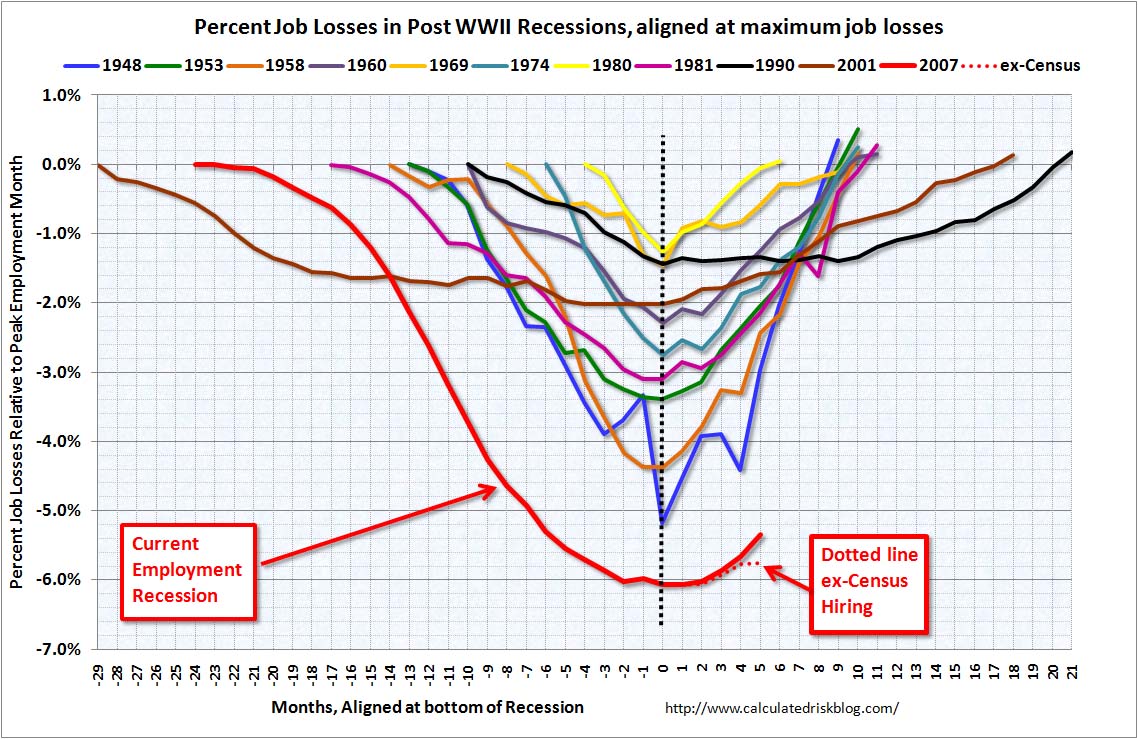
courtesy of Calculated Risk
~~~

courtesy of NYT Economix
~~~

courtesy of Infectious Greed
~~~

courtesy of The Chart Store
~~~

courtesy of Bruce Steinberg
~~~

courtesy of Gluskin Sheff
~~~

courtesy of Chart of the Day
~~~

courtesy of Gallup
~~~
 courtesy of NYT Economix
~~~

courtesy of The Chart Store
~~~

courtesy of NYT Economix

What's been said:
Discussions found on the web: