Invictus here.
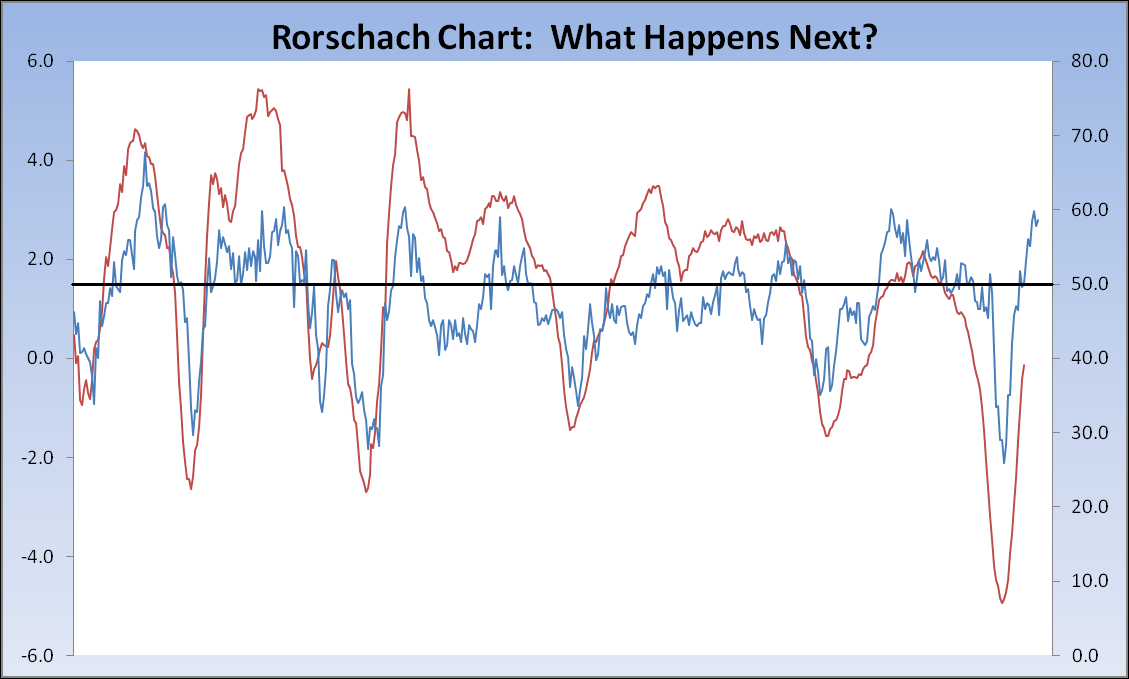
Okay, so here’s today’s thought experiment. Instead of putting up some charts or tables and providing my own interpretation (not that I’m ever shy about doing so) , I’ve decided to post a Rorschach Chart. Below is a comparison of two data series that have a meaningful correlation (>0.70, with a lag in this case) over time. The two series are identified below the fold. For now, here’s the chart. So, what does it all mean (if anything)?
NOTE: Blue line goes to the right-hand scale, red line to the left-hand scale.
(Data Source: St. Louis Fed)
The two series are:
(Blue, RHS) ISM Manufacturing: Employment Index (NAPMEI), Index, Monthly, Seasonally Adjusted
(Red, LHS) Total Nonfarm Payrolls: All Employees (PAYEMS), Percent Change from Year Ago, Monthly, Seasonally Adjusted
Payrolls are lagged by six months. ISM was released today, hence my interest in running this chart. NFP is due on Friday.


What's been said:
Discussions found on the web: