Tomorrow is the big NFP report, and expectations are soft — about 25k.
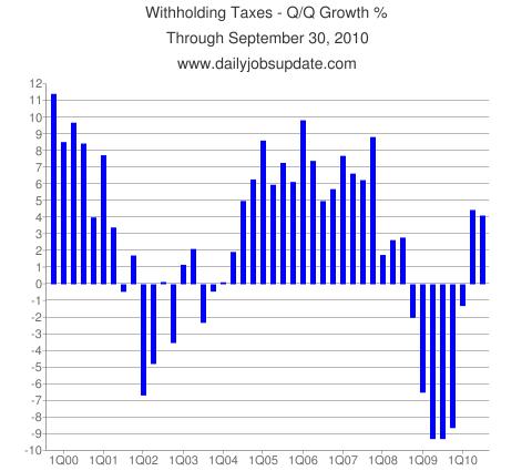
I’ve heard lots of reasons why tomorrow’s data will disappoint. That pervasive negativity is what makes these charts stand out — they are far less awful than the consensus.
I have no special insight or strong feeling or even much of an opinion about tomorrow’s number.
Four-Week Chart Withholding Tax Chart
Q/Q Growth Withholding Tax Chart
chart courtesy of Daily Jobs Update
Matt Trivissano adds:
“The current four-week period won’t be complete until Monday, however, we wanted to send this out ahead of Friday’s big jobs report. The latest bar on the chart is shown in red. It is calculated with the last 16 business days compared to the corresponding 16 days from last year. So, it’s a little more than 75% complete.
As you can see, at +6.24%, the period is shaping up very nicely, and things are looking pretty strong year-over year.
Of course, the BLS tries to estimate month-to-month jobs growth, so that is a different metric. However, judging by this data, it seems like the Fed’s planned second round of “quantitative easing” is not needed, and the Fed just might be making its traditional mistake of staying loose too long. Perhaps strong jobs-data this week would cause the Fed to cancel QE2. Of course, if the real reason for QE2 is to weaken the dollar in order to facilitate President Obama’s goal of increasing exports, then the Fed may go ahead with the money-printing anyway. But last I heard, smashing the dollar wasn’t one of the Fed’s mandates.
Note: the final version of this chart will be published around 5pm on Monday here.
Another surprisingly upbeat employment chart comes from Tom McClellan of the McClellan Market Report:
Employment vs CPI Rate of Change
Source: The McClellan Market Report


What's been said:
Discussions found on the web: