My recent Hey, Big Spender piece (the third in a series, it turns out) drew a fair amount of hyper-partisan commentary. Most of it followed BR’s Comment Caveat almost to the letter.
However, it was at another website that, after years of blogging, I was finally busted. Yes, I was called out on the “intentionally misleading crap” that I posted. In an effort to redeem myself, herewith my mea culpa.
It was pointed out in comments and at the website that busted me that the series I ran – Real Government Consumption Expenditures & Gross Investment (GCEC1) – is not all-inclusive. I neglected to say that in my post, figuring that those who clicked through to the Krugman post I cited might notice that he slyly slipped this in (emphasis mine):
Here’s another indicator. Look at government (all levels) purchases of goods and services, that is, actually buying stuff as opposed to transfer payments like Social Security and Medicare.
So, those sharpies who read Krugman’s post with an eagle eye might have gleaned – maybe – that GCEC1 does not represent the totality of government spending. The point, of course, was to capture what we might refer to as “core” government spending – what my critic rightly refers to as “bullets (and rifles) bought for the defense department, the toner cartridges for the printers, check stock for the Treasury, computers for the offices, drugs and supplies for doctors and “investment”, such as building new buildings and renovating old ones, building roads and bridges and similar.” Exactly the point – the things over which an administration arguably has some measure of control, and exactly the reason that series was relevant to the post. It was an attempt to capture government spending ex- things like the big three.
To demonstrate exactly how fraudulent my post was, my critic put up a chart of…well…he put up a chart of the same series I used, except un-rebased, which accomplished nothing. There is actually no fact-based or data-driven rebuttal to what was presented in my prior post, or that of Professor Krugman, just a fair amount of bluster. So, being as this is a mea culpa and all, I’m going to do his homework for him and demonstrate exactly how wrong I was.
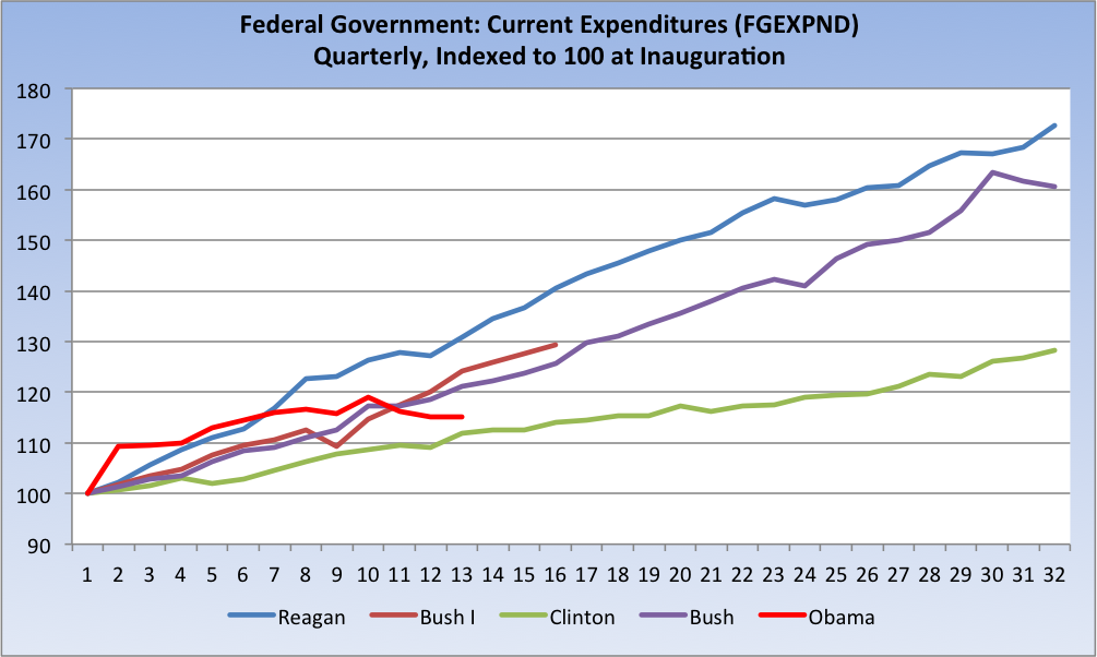
First things first: My critic says that actual government spending is roughly $3.8 trillion. I assume he’s looking at Federal Government: Current Expenditures (FGEXPND), which peaked out a year ago at about that $3.8 trillion level ($3.8295, to be exact). So let’s pull back the lens and see how the Obama administration is doing on that metric and view what I like to refer to as the Whole Enchilada:
It’s a sure bet that Obama’s almost immediate near-vertical rise is stimulus related [BR: What about ongoing GSE Bailouts?]. And now, well, you can just see for yourself that he’s spending like a drunken sailor, just like that bastard Clinton did. So, there’s your “all in” chart. Any criticism of Obama’s spendthrift ways should start with an explanation of that red line relative to the other four (well, three, actually, since Clinton was a loser with a capital “L”).
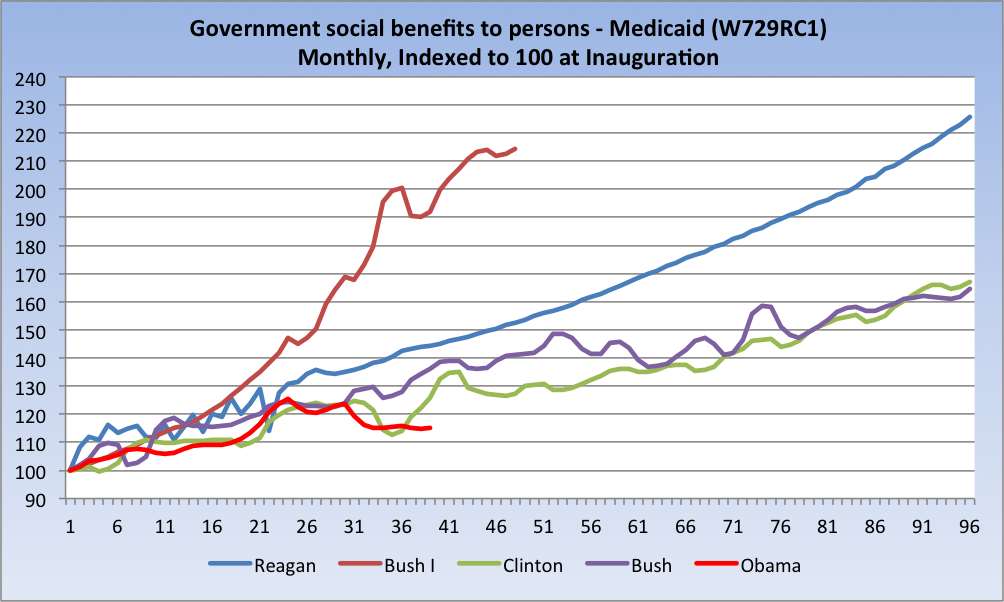
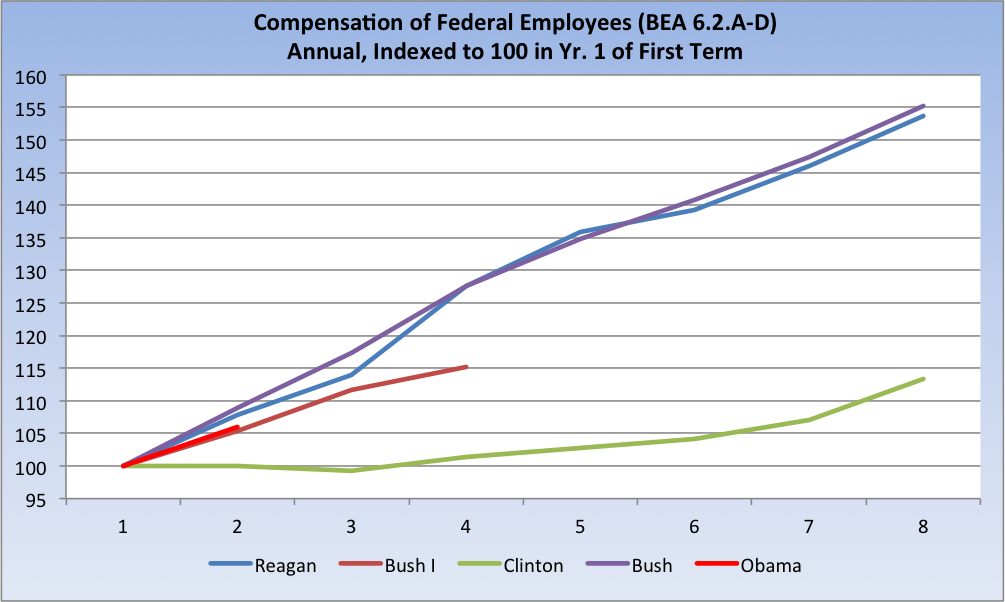
My critic (correctly) points out of the series I used: “Left out are all the other expenses — things that are not consumption. Like salaries. Like transfer payments such as Medicare, Medicaid, welfare and Social Security, other than physical direct consumption in those programs.”
Yeah, well, let’s just see about that, shall we*:
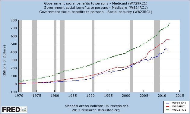
For the 30,000-foot view, here are the Big Three from 1970:
(charts and analysis continue after the jump)
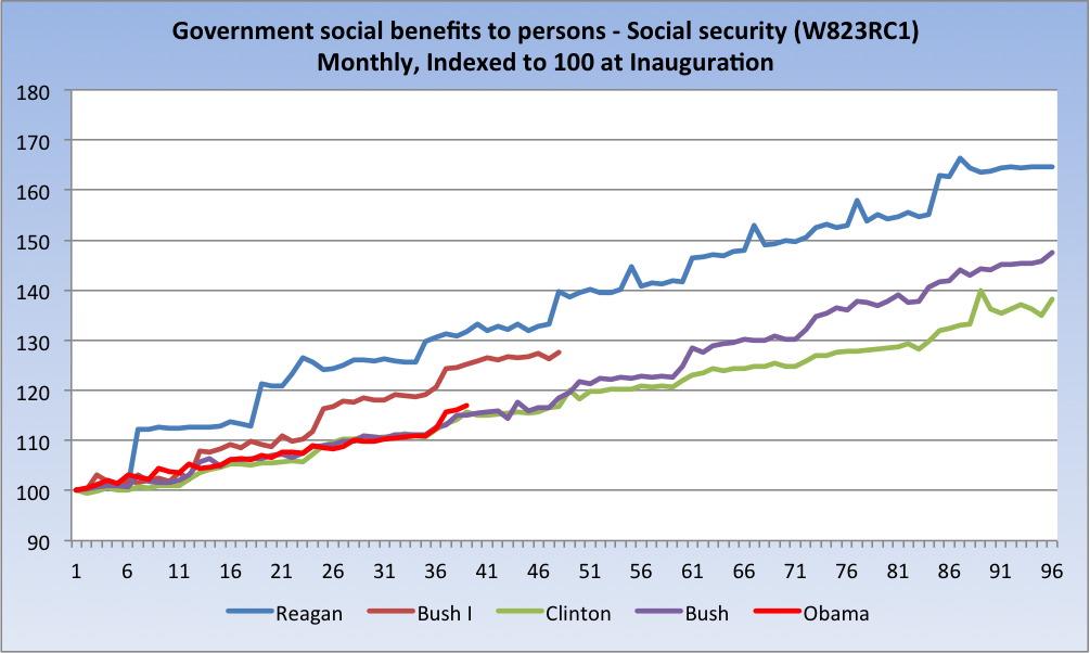
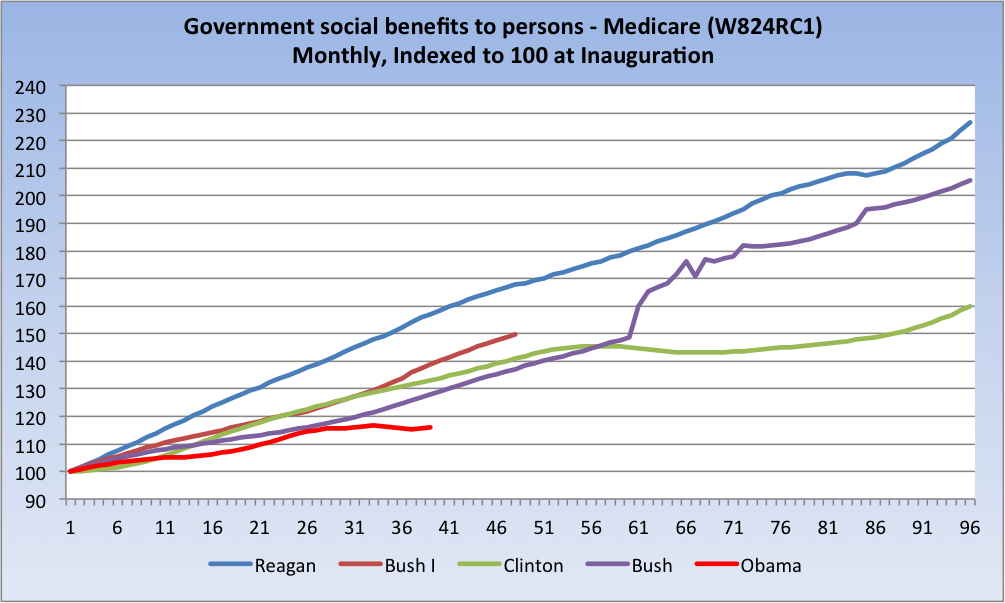
Now, a look at each, indexed to 100 at presidential inaugurations:
(Source: FRED, author calculations)
It took a little digging and a call to BEA to track down “salaries,” but I did find it (Tables 6.2.A to D):
There is no series I could find defined as “welfare,” so I’ll leave it to my critic to do that little bit of homework. After all, I’ve done all the heavy lifting.
So, Mr. Denninger, please either refute the data I’ve presented here (all the series are identified), issue a correction/retraction/apology at your site, or accept that you were simply blinded by ideology. It does not sit well with me to be accused of fraud.
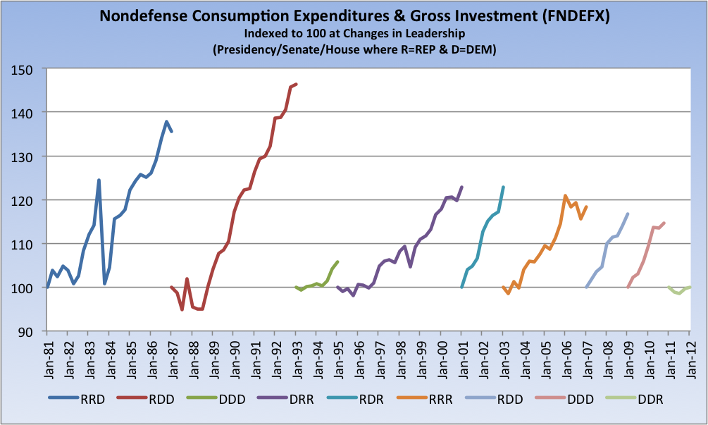
Finally, on a related note, it might be constructive to update a chart I first ran on a similar theme some time ago:
Final note: Here is how BEA defines Government consumption expenditures and gross investment: “The value of services produced by government, measured as the purchases made by government on inputs of labor, intermediate goods and services, and investment expenditures. It is the sum of government consumption expenditures and government gross investment.”
See also: Catherine Rampell, NY Times: “Government spending has fallen for six straight quarters as Recovery Act funds have been exhausted and state and local governments have struggled with tax revenue shortfalls. Accordingly, the public sector has been shedding workers relatively consistently since the recovery officially began in mid-2009, with the exception of a brief spike of temporary hiring during the decennial census.”
Floyd Norris, NY Times, Government is Getting Smaller in the U.S.
I have not read Chris Turner’s critique, Rebutting Paul Krugman: The Rest of the Story, but its on my list of weekend reading.
Fraudulently yours,
@TBPInvictus
__________________
* I will certainly stipulate that any series presented may have been subject to legislative and/or accounting-related changes. For example, Reagan’s Medicaid line starts off somewhat noisy and then becomes remarkably smooth. Similarly, Bush I’s Medicaid line looks a bit anomalous. If anyone is aware of specific legislation or accounting changes that may have (or did) impact any of those series, please advise in comments. That said, the numbers are exactly as downloaded from FRED.


What's been said:
Discussions found on the web: