click for larger chart

Source: Federal Reserve
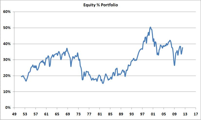
Given yesterday’s Bonds beat Stocks discussion, I thought this chart might be worth reviewing. Its from the most recent Federal Reserve Flow of Funds Accounts of the United States (Q1 2012).
My thesis continues to be that the death of equity type attitudes are cyclical; When there is widespread equity exposure (“enthusiasm”) valuations tend to be higher and risk levels elevated.
Here we are, 12 years after the dot com crash, 5 years after the financial crisis, and equity exposure remains higher than any period before 1997 — but appreciably lower than the dot com years; exposure to equities is modestly lower than the housing boom period as well.
Note that 1974 was when ERISA laws created the 401k industry, and that could account for some of the 1974 to 2000 increase.


What's been said:
Discussions found on the web: