So the redesign of the site is proceeding apace. The interior work is just about done, and I am very jazzed about what Tim developed. In terms of usability it is outstanding, and has a clean modern feel. All that is really left are the header graphics and background.
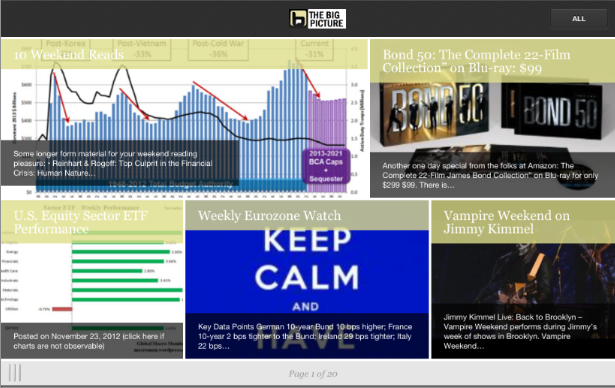
One of the most requested features has been an improved mobile version for iPhones, Androids and iPads. It is not finished, but I can show you an early version of what the layout kinda is going to look like: Click or paste the URL “www.onswipe.com/bigpicture” on any mobile device. If you are on a desktop, you can see the graphics below.
This is still a rough version, and we have to sync the new graphics, font, color family, etc. The basic concept is that Onswipe’s software automatically pulls the headline, a sentence or two, and the first graphic it sees of each post. Its pretty sweet!
The iPhone/Android version puts up one post per screen, with a feature button top left, and a drop down menu top right (for seeing only content now currently under tabs) op right:
The iPad/tablet version has 5 posts on the front page, you can launch any single post, or swipe to see the next 5 with similar feature/drop down buttons:
I already disabled the other WP plug in I was using, which seemed to be universally disliked.
Any thoughts, constructive feedback, criticisms would be appreciated . . .


What's been said:
Discussions found on the web: