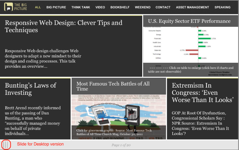
Ask, and Ye Shall Receive:
The single biggest request I get about the site has been for an improved mobile version of TBP. Previously, I was using a simple Word Press plugin for mobile, and it was pretty weak.
It took some time and work, but the new and vastly improved version of the Mobile site is now live — and its pretty fantastic. Mad props to the team at Onswipe, they did an awesome job.
This version went live over the weekend — we are still in beta testing, so expect bugs and glitches to keep popping up in this version. (If you find any, please use the comments to tell me, and I will forward to the developers).
If you go to Ritholtz.com on any mobile device, you should see it (but some devices and settings don’t). If you want to see what it looks like, point any mobile browser to:
I’ll post the graphics after the jump.
Its mostly self explanatory, but let me mention a few hidden items:
• Both phones & tablets work similarly — they each have portrait and landscape orientations, but on phones the swipe is up and down in portrait mode.
• On tablets, the menu is laid out across the top; on phones, the pull down menu is top right;
• To find the button for the desktop version, grab the slide, swipe it to the right, and there is that button;
• Bug Alert: Once you go desktop, I don’t know how to revert back to the mobile version. The workaround is to use the mobile address.
I’m pretty jazzed at the way it came out– looking forward to your comments . . .
Phone version


What's been said:
Discussions found on the web: