
click for larger graphic
Source: Radio Open Source
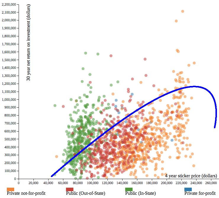
When it comes to paying for college, lots of people are asking “why does it cost so much, and it is it worth it in the end?”
Radio Open Source has a scattergram chart above that helps answer the question. It shows the increasing cost on the horizontal (X Axis) and the return on that investment on the vertical (Y Axis).
There seems to be a slight advantage in returns to private schools versus the (In State) public colleges, but at a very great additional cost.
Eyeballing this, the area under the curve shows a fairly poor return on investment. No wonder so many college graduates are unhappy with their student debt.

What's been said:
Discussions found on the web: