
Philippa and Doug are co-editors of The Liscio Report, an independent research newsletter focusing on the U.S. labor market, debt issues, and international flows. Their work includes month-by-month tracking of tax revenues at the state level, and detailed analysis of federal data releases.
~~~
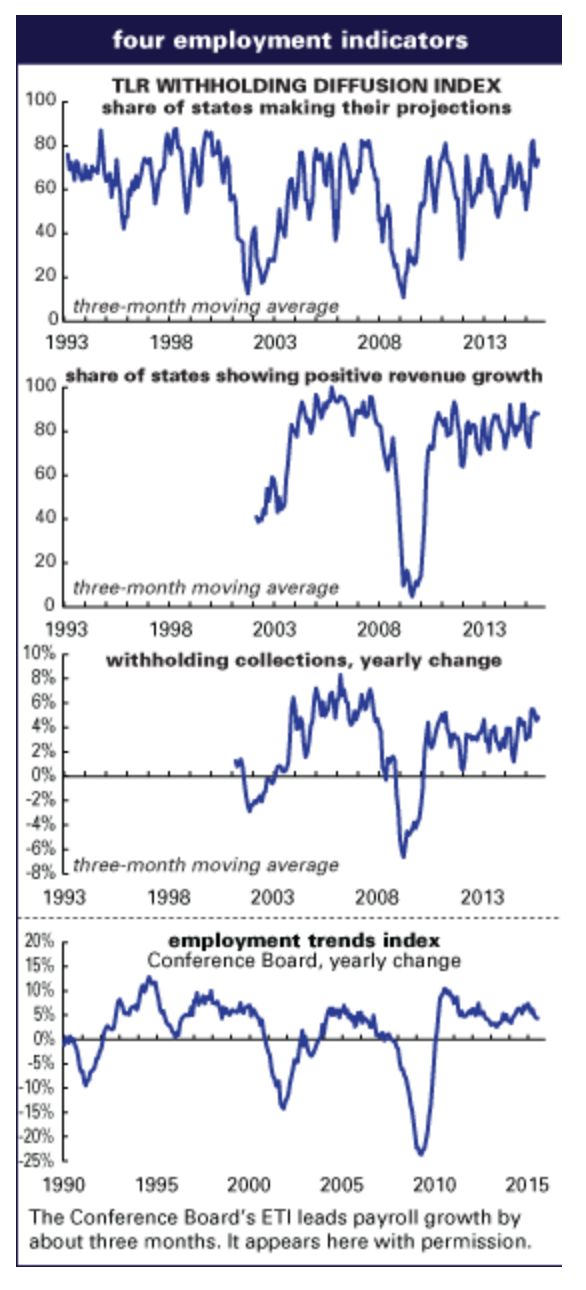
State-level withheld tax receipts were stable between July and August. Overall, 82% of the states in our survey hit their projected collections for the month, basically even with July’s 80%, while those reporting growth over the year slipped to 83% from July’s 90%. The average over-the-year rate of change moved to 4.5% from July’s 4.9%, and the margin from forecast rounded to 1.0%, also level with July’s 1.1%. (All averages weighted by state population.)
“No surprises” was taken to be a good thing, and overall comments from our contacts were encouraging as well. Some noted solid advances in property transfer taxes, and others were encouraged by new data on wages indicating a healthier trend for our consumers. Our contact in one of the rig states believes they will not face large revenue shortfalls if oil stabilizes in its current range, even though the last two months have been soft. A few western states see continued solid growth, even “full steam” growth in one, but in other parts of the country some contacts reported that they think the current strength will hold, but is unlikely to advance. There looks to be some weakness coming in states heavily reliant on agriculture, which would not be a surprise.
Fed Watching: over-thought and overwrought, but…
Over the last, oh, eight years since the cart went into the ditch, the Federal Reserve has provided a road map to their thinking and often intense concerns in the research papers presented at their late summer Economic Symposium in Jackson Hole each year. The themes of those meetings provide an overview of the trajectory of their thinking.
In 2011 they titled the confab a hopeful, “Maximizing long-run growth.” Well, that didn’t happen. Or, perhaps better to say that if you are relying on monetary policy to do the heavy lifting all by its lonesome in what we would argue was a liquidity trap, that maximum is going to be a few bricks short of a load.
We’ve all got to move on from what might or should have been done, but keep in mind that the share of the deficit caused by stimulative fiscal policy began to shrink in 2010, meaning we’ve been trying to grow against a contractionary “fiscal impulse”—the yearly change in the share of the deficit caused by the business cycle against the share caused by policy—ever since.
2012 brought us “The Changing Policy Landscape.” Fiscal policy was now negative—the fiscal impulse dropping to -1% after hanging just below the zero line—unemployment, at 8%, down 2 percentage points from its height, but still close to 4 points above its prior low, and the zero bound, formerly, and happily, merely a “theoretical curiosity” shackling monetary efforts. Around this time questions about QE’s ability to mitigate unemployment were raised, but that wasn’t the only card on the table—the liquidity trap remained a scary prospect.
That year woeful papers included, “The “Big C”: mitigating contagion,” and the more whimsical, “The Dog and the Frisbee,” which noted that a physicist would have a hard time spelling out the dynamics of catching a frisbee, yet dogs, who we hope don’t worry about model uncertainty, do it all the time. Not sure we needed the dog; the authors’ conclusion, that modern finance is likely too complex, and since complexity generates uncertainty, not risk, we’d want new regulations to be simple, probably stands on its own. So how to proceed with effective regulation was in there too.
2013’s Global Dimensions of Unconventional Monetary Policy tackled imbalances and volatility caused by large asset purchases, noted that the zero bound was proving to be more recalcitrant than had been anticipated, unconventional monetary policies had had some success but were not without risks, communication was important, and more coordination among central banks would probably be helpful, but was unlikely to happen because of the importance of remaining focused on domestic issues.
Re-evaluating Labor Market Dynamics, 2014, noted that central bankers around the world believed they had tools to soften unemployment, while acknowledging that mistaking structural unemployment for cyclical unemployment could be inflationary, and that labor force dynamics within the U.S. were less fluid than in the past, which remains true to this day. They also noted that despite having significant effects of the labor market, technology’s ability to displace workers is limited, also, we would argue, still true. Chair Yellen spoke about “pent-up wage deflation,” the result of employers’ reluctance to cut the wages of workers they retained in the recession, followed by eagerness to hire new workers on the cheap as the recovery built up steam. Check.
This year’s meeting centered on inflation, or the lack thereof. The first paper, “Customer Markets and Financial Frictions, implications for inflation dynamics,” noted that interest-rate policies that “put a great deal of weight on inflation stabilization lead to significantly worse economic outcomes than rules aimed at stabilizing output.” International spillover effects got a lot of ink, and, yes, those coming from the U.S. eclipse those out of other countries on the U.S. Additional concerns included too much emphasis on academic modeling, and too little on the “confounding dynamics” that cloud interpretations.
The FOMC has prepared the world for their first step away from easy policy, or perhaps towards dis-ease. And they have mentioned that if they feel such a move was a mistake they will backtrack. Another thing they might be considering is a move of less than 25 basis points, which they did in the mid-1980s (thanks MD). That would get people’s attention, and underscore their commitment to creep toward normalization at a pace that does not spook anyone.
Coda: Workers are slowly coming back into the labor force, but we apparently can make only faltering progress there without a targeted job program, especially one that moves the under-unemployed closer to their skill levels—infrastructure anyone? That needs to be a national debate we seem unwilling to have.
Sideways on the Job Ladder
Many observers have been wondering why wage growth has remained modest despite the fall in the unemployment rate to a level commensurate with many definitions of “full employment.” One explanation is that the unemployment rate is a misleading guide to labor market tightness because of labor force withdrawal and the persistently low participation rate. But economists at the New York Fed have come up with another interesting possibility: fewer workers are moving from one job to another without an intervening period of unemployment, and that matters for wages.
As the graph below shows, the share of workers going directly from one job to another is at a near-record low, and has risen only slightly from its Great Recession depths. (Apologies for the blurriness of the graph; we took it from the New York Fed’s website.) The wage effects of this look considerable. A special survey done by the New York Fed for its Survey of Consumer Expectations shows that a worker moving from one job to another with no period of idleness experiences an average hourly wage increase of 6.9%; a worker moving through unemployment before finding new work experiences an average hourly wage decline of 18.5%. Average hourly earnings for the job–job worker also look to rise more sharply with the new position than for the job–unemployment–job worker. Job tenure also looks longer and more secure for the workers who find new employment without a period of unemployment.
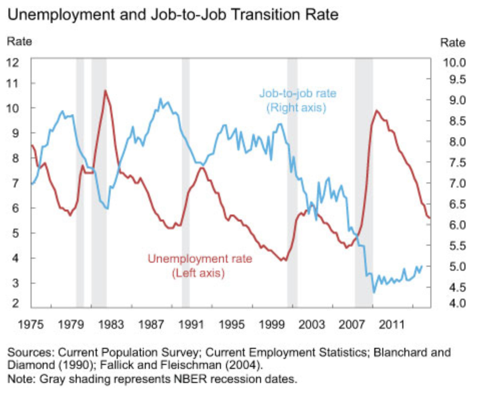
So it will be important to scrutinize the monthly job flows numbers (as we regularly do) to see when this pattern changes. Until it does, wage growth may remain more subdued than traditional Phillips curve analysis would suggest.
Liquidity Clog
As the Fed moves towards “normalizing” interest rates—assuming that recent market tremors won’t lead to a serious change of heart among the FOMC—people have stopped talking about the liquidity trap. It’s true that consumption and investment spending have recovered considerably—but things are still not fully back to normal. There still seems to be some hoarding going on. Maybe we have something of a liquidity clog, if no longer a full-blown trap.
Here’s an illustration of that: the collapse in the velocity of money. (See graph, below.) In canonical monetarist theory, velocity is supposed to be more or less constant, and the growth in money determines the growth in nominal activity. As the classic formula puts it, MV=PT (money times velocity equals prices times transactions). Theory often doesn’t match reality, though. Historically, velocity has been anything but constant, but its recent collapse is fell-off-a-cliff striking.
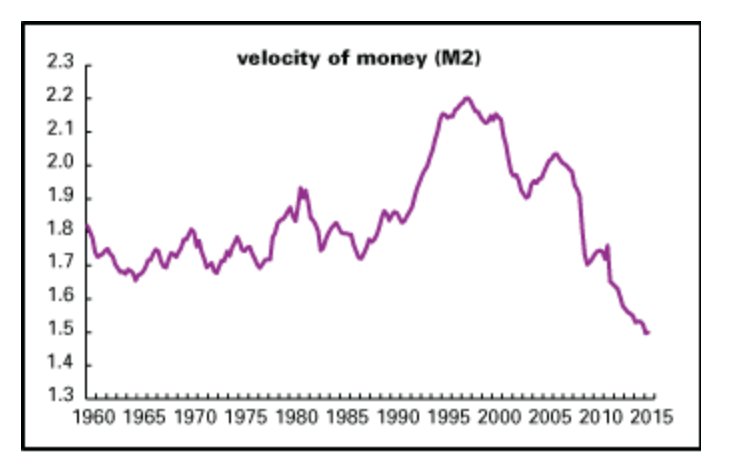
From 1960 to about 1990, velocity (nominal GDP divided by the M2 money supply) remained in gently rising channel, between roughly 1.7 and 1.9. With the 1990s boom, it broke out of that channel, peaking at 2.2 in 1997. It fell with the bursting of the New Economy bubble and declined in 2003. It recovered with the mid-2000s expansion only to collapse with the recession—and keep collapsing with the recovery. As of the second quarter of 2015, it was 1.5, a record low. Looked at another way, since the end of the recession in 2009Q2, M2 is up 42% and nominal GDP just 25%.
So the hoarding instinct looks not to have died completely. The system is awash with liquidity, but real activity is still subdued.
GDI vs. GDP: Caution
From time to time, following the lead of Fed economist Jeremy Nalewaik (see his paper here, we’ve looked at the difference between the growth in gross domestic product (GDP) and gross domestic income (GDI) for clues to the economy’s future direction.
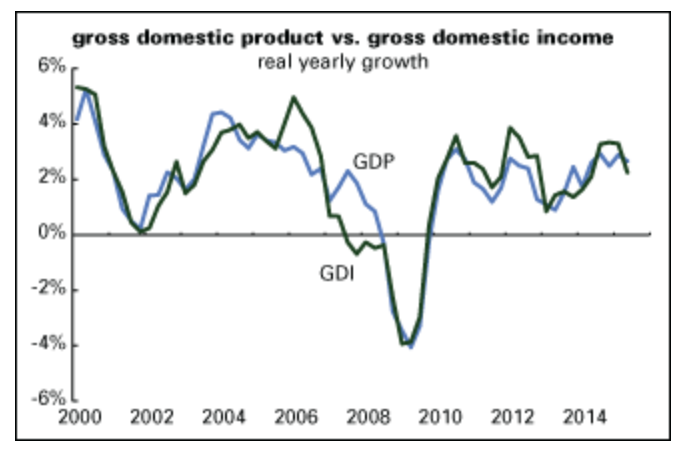
Although the Bureau of Economic Analysis has long featured GDP as its preferred measure, Nalewaik argues that GDI might actually be worth paying more attention to. Though in theory both measures are supposed to be equal—income is earned in production, so the two measures are just two perspectives on the same set of transactions—in practice they’re not, because they come from different sources. Income might be the better measure, especially at economic turning points, because the underlying data is more reliable, particularly the definitive wage and salary data from the Quarterly Census of Employment and Wages (QCEW), available five months after the end of every quarter.
The latest data suggests that the enthusiasm over the second quarter’s revised 3.7% annual growth rate in GDP may be overdone. GDI was up just 0.6% for the quarter. The previous quarter, GDP was up 0.6% and GDI, 0.4%. Of course, we don’t yet have the QCEW data for the second quarter, so the GDI measure may be overdoing weakness. But given the useful history of GDI, it might be prudent to see it as a warning against making too much of the U.S. economy’s robustness.
With the annual revisions to the national income accounts, the BEA began presenting an average of GDP and GDI (table 1.7.6, line 12, for connoisseurs). It might be a good idea to begin looking at that as the best single measure of economic trends, if you want one of those. It was up a decent but hardly exuberant 2.1% (annualized) in the second quarter, and 2.5% for the year. Those numbers look to be pretty much in line with trend growth over the long term.
Profits
As the graph at left shows, corporate profits in the second quarter (expressed as percent of GDP) remained strong, but are off their peaks for the cycle. (Profits are adjusted for inventory valuation and capital consumption. We’ve seen some analyses circulating that use unadjusted figures, a nonstandard practice that looks like cherry-picking to us.) For nonfinancial corporations—our preferred measure, since they’re the ones who make goods and services rather than just moving money around—pretax profits were 7.1% of GDP, unchanged from the previous quarter; after-tax profits were 5.1% of GDP, down 0.1 point for the quarter. Both are down about half a percentage point from their cyclical peaks. For the entire corporate sector, pretax profits were up 0.1 point for the quarter, but are down more than half a point from their peaks.
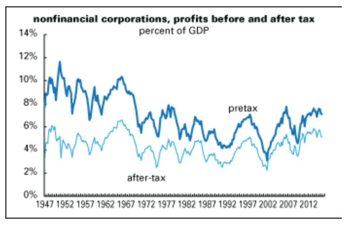
Profitability is a long-term leading indicator, generally peaking a year or three before the broad economy. The trajectory of profits suggests that while the expansion is not yet in its senescence, it’s getting mature.
C&I Loans: to accelerate?
In what may be a measure of the credit system’s return to normalcy, to borrow a phrase from the 1920s, we haven’t scrutinized the Fed’s survey of bank loan officers for a reading of whether credit standards and terms are tightening or loosening for a while. But we thought we’d take a look for old time’s sake.
Unfortunately, the Fed changed a lot of the questions and categories for the survey, making it hard to do historical comparisons. One thing that hasn’t changed, however, are the questions about attitudes towards extending commercial & industrial (C&I) loans, which are crucial to the day-to-day operations of business.
After a slight tightening of attitudes in the first half of 2015, the third quarter survey shows a loosening of attitudes. A net of -7.0% of large banks and -6.0% of small and medium-sized banks reported tightening of standards (the negative number means that expansiveness was on the increase). That compares with -5.3% and -1.4% in the second quarter.
As the graph at left shows, attitudes lead behavior by a year or two. Growth in C&I loans has slowed some this year, perhaps reflecting the tightening of attitudes that began in the second quarter of 2014. Loan officers also reported increased demand for credit in the latest survey after an ebbing in the previous several quarters. If historical patterns continue, and the loosening of attitudes in the third quarter persists, we might see an acceleration of C&I lending late this year and early next, which would be good news for continued growth.
Friday’s Employment Numbers
Generally when you hear that something “always” happens during a certain month it’s just not true, but there is some truth to the tendency of August payrolls to come in below trend. In 25 of the last 35 years, the initial number was well under trend and survived revisions, and in the last five years, all Augusts were below trend, and three of those held. The average miss is 55,000.
Some years ago we noted to our subscribers, and to the BLS, that August and September revisions tend to be considerably larger than average, and overwhelmingly upward, so not random stuff. The BLS confirmed the observation and set about to rectify the problem, which has a lot to do with data collection and when school workers begin the year—both non-economic issues of the first water. They have made headway, but the problem crops up from time to time. The FOMC is surely aware of this, so a weak number will probably be bracketed.
We expect stable job growth to continue. We’re forecasting 199,000 private gains, and 204,000 overall (rounding be damned), with a 5,000 assist from government. That’s already quite a bit below trend, and we could see a lower number, but one that’s likely to reverse, if the issues outlined above come out swinging.
We expect no change in the unemployment rate, 5.3%, unless buoyancy in the Jobs Plentiful component of the confidence report sends job seekers back out onto the pavement, and think the work-week probably inched back to its stalwart 34.5 hours.
Earnings carry an upside risk. We’re forecasting a 0.3% gain, but toyed with a “shocking” 0.4%. That still would not translate into inflationary wage pressure, but it would be a bucket of ice water for those hoping the FOMC will stay their hand.
Or their toe. We are hoping that once the FOMC dips that collective toe in the water, we can have a moratorium on the wage debate.
A week, an hour, even a minute’s respite?
Philippa Dunne & Doug Henwood

Inflationary wage pressures are the least of our concerns and a parochial economic perspective unwise.
Inflation, the Fed, and the Big Picture
…while policymakers’ desire to be prepared for potential future risks to price stability is understandable, they did not place these concerns in the context of recent inflation developments at the global level – or within historical perspective. ….
Short version: There is reason to believe that US, Europe and Japan QE was not simply a domestic issue for each but a critical factore in forestalling 1930’s style depression on a global scale.
“…In 2011 they titled the confab a hopeful, “Maximizing long-run growth.” Well, that didn’t happen…”
“…but things are still not fully back to normal…”
There are so many masters of the counterfactual out there. Republican’s said US policies would lead to a deeper recession, depression, hyper-inflation.
They were wrong. The stock market tripled. We have eight million new jobs. The dollar is strong and rising. GDP is at a record and the oil prices is halved as global tensions kick along at their usual, dictator-based pace.
The Fed will raise and Obama should be thanked, memorialized, and remembered.
If the Velocity of Money (chart above) can be interpreted as “hoarding” still going on in the U.S. economy, why did another of this week’s reports indicate the public is back to incurring debt and that Public and Private debt is now (2nd qtr. 2015) back to NEW record levels? Is it that the amount of debt is being accumulated by fewer people or entities with therefore greater aggregate debt; OR, is it that something is awry w/ the stats or their interpretation? The new record in debt suggests at least at one level that the “liquidity trap” is indeed alive and well.