This is a very interesting chart:
How Large are Incomes In Each US County Compared to the Value of the Homes?
Click for interactive
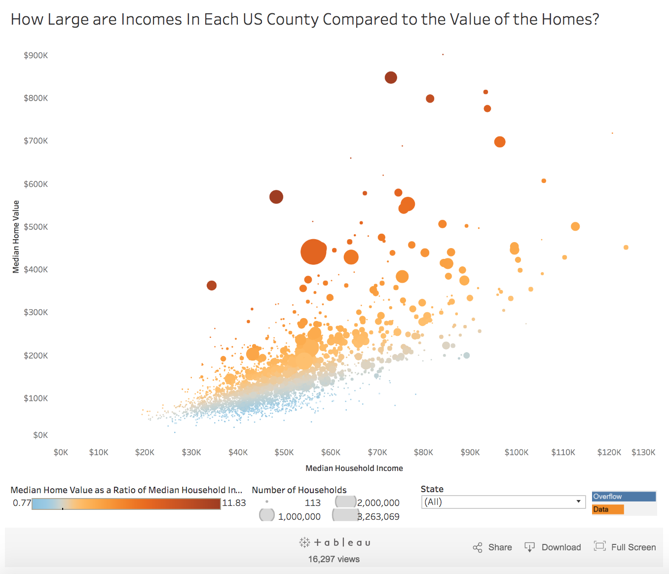
Source: Visual Capitalist


This is a very interesting chart:
How Large are Incomes In Each US County Compared to the Value of the Homes?
Click for interactive
Source: Visual Capitalist
Get subscriber-only insights and news delivered by Barry every two weeks.