
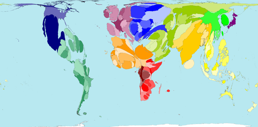
This map shows the proportion of the world’s international emigrants coming from each territory. This map indicates that the worldwide spread of origins is not dominated by any single region. Nevertheless variations exist. Regional averages for the percentage of the population that emigrate range from one percent of the population in Southern Asia, Eastern Asia and Japan, to eight percent in Eastern Europe and nine percent in the Middle East.
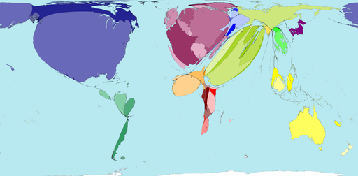
Richer territories tend to experience net immigration (greater immigration than emigration). Just under half of the 200 territories mapped currently experience net immigration. Those territories with net emigration (greater emigration than immigration) have size zero on this map.
Regions experiencing the highest net immigration are North America, Western Europe and the Middle East. Together these three regions account for 79.5% of world net immigration. The United States alone receives 37.1% of the world net total.
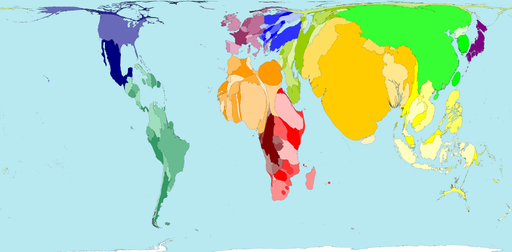
Worldwide, children make up a third of the population. In 2004 there were 1,826 million children aged under 15. Only children under 15 are shown in this map and graph. Africa has the highest percentage of children. In Uganda and Niger half the population is under 15 years old. In Italy, Spain and Japan only 14% of the population are children aged under 15.
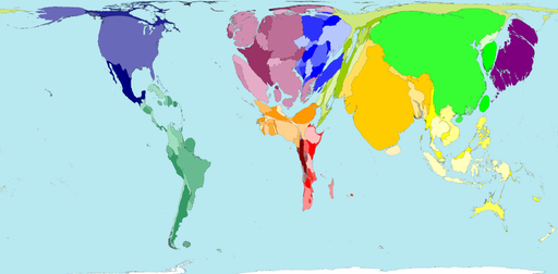
In 2002 7% of the world population was over 65 years old. Only 1% of the population of the United Arab Emirates was over 65 years old. China has the largest elderly population (92 million) but this is only 7% of the Chinese population. Growing proportions of elderly people are partly a result of people living longer and, often, of fewer births reducing the size of the younger population. Africa is home to only 6% of the world’s population aged over 65.
Source: Worldmapper
