
You know the expression, “Off the charts?”
I think many people do not truly understand exactly what that phrase means.
For any endeavor that generates metrics that can be tracked, quantified, analyzed, and/or depicted graphically, an “off the charts” moment occurs when the latest data point in the series is so far beyond anything previously experienced, that it changes its overall range and framework.
The new info completely shifts how the data series is depicted, visually dwarfing prior eras and prior extreme highs or lows.
There are many ways to phrase this: Exponentially different, orders of magnitude, standard deviations, however you want to describe it. It means that the new data is literally so far off the baseline, that any data analyst, economist or statistician must physically reconfigure their charts, in order to be able show the new data point in context to prior history.
Today, I want to share 4 such economic data points that are simply off the charts:
1) GDP: The latest data for the quarter shows a -32.9% for the quarter, or about -10% for the year, Note that the Eurozone, with a more stringent lockdown, fell about 40% over the same period. They paid a short term price but their economies are way ahead of America’s in the post-pandemic re-opening.
There simply is nothing in history remotely comparable to this. Even during the Great Financial Crisis of 2007-09 had a collapse of GDP of -4%:
Gross Domestic Product
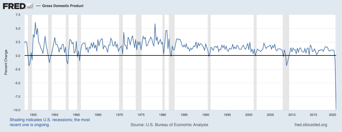
Source: FRED
2) Unemployment Rate: There simply is nothing like what we’ve experienced in 2020. Unemployment was under 4, and it shot up to ~15% — almost quadrupling. If you look at the worst prior recessions such as the double dip in 1980-82 or the terrible 72-74 recession, or of course, 2007-09, the 2)Unemployment Rate barely doubled.
40-50 million people unemployed, and many unable to get counted suggests a real world unemployment rate closer to 20 or even 30%, rather than the measured 15%. Regardless, no prior recession on record shows a quadrupling of unemployment — and in mere months, too.
Unemployment Rate
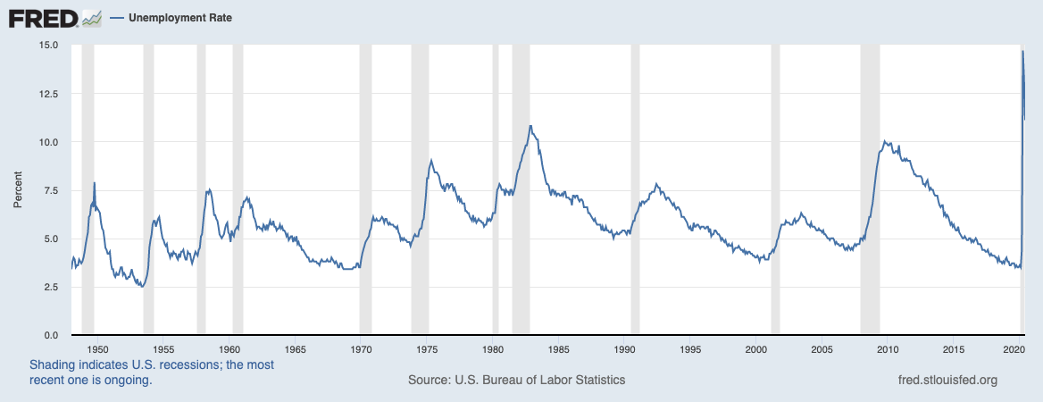
Source: FRED
3) Initial Claims: New claims for unemployment insurance payments is another data series where the local state unemployment offices simply could not keep up with the demand. There was never a period where we saw a surge of a million job losses; the worst of the GFC was a 800,000 month.
The system was simply not designed to manage 7 million new claims, plus the 100s of 1,000s of people who could not get through by phone or website.
Initial Claims
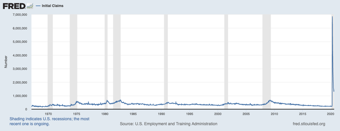
Source: FRED
4) Months to Recover Peak Employment: If you are a long time reader of the Big Picture, you have seen earlier versions of this chart, just about every month for many years post GFC. It shows all of the post World War Two recessions, how deep the unemployment levels reached, and how long it took to recover to the pre-recession level of peak employment.
Most recessions take 18 months and 30 months; Nothing previously compared to the depth and length of 2008-09, that blue line extends from the 2007 peak to 2016! Not only did it take almost seven years to recover, but it is far deeper than every other recession. There was simply was nothing comparable to this.
Until 2020, when the speed and depth were simply off the prior charts.
Months to Recover Peak Employment
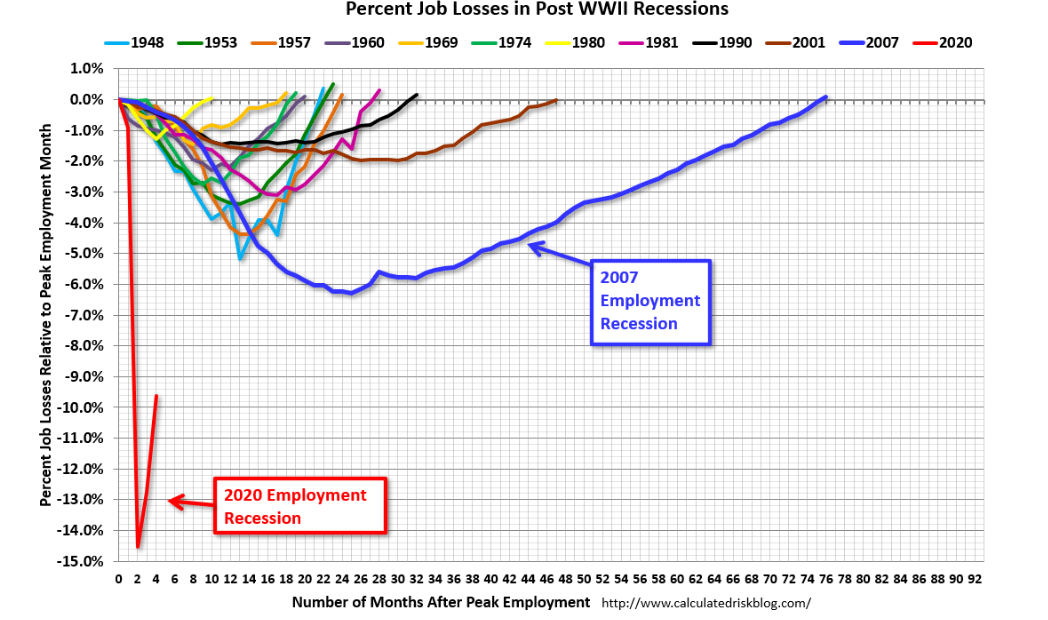
Source: @CalculatedRisk
One of my favorite parts of President Franklin Roosevelt’s New Deal was the creation of the many various government departments to measure, track and report economic data. Commerce Department, Bureau of Labor Statistics, even additions to Census were part of these policies.
I would bet that when FDR created these bureaus whose divisions employs 1000s of economists, statisticians and mathematicians, none of them would have ever imagined off-the-chart economy like the one we are living through today.
