While I am traveling, its going to be The Chart Store week here at the Big Picture. I will feature a different TCS graph every day. If you become a subscriber of theirs ($239 per year), you gain access to their massive repository of great weekly chart porn, and their library of more than 5,000 charts.
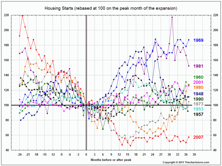
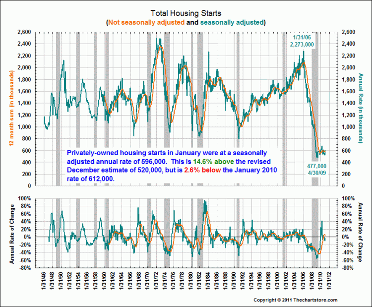
In light of today’s Case Shiller data, lets look at a few Housing Start charts you may not have seen before: The first rebases the post WWII housing cycles from peak to trough; the second is a straight up look at current starts:
>
~~~


What's been said:
Discussions found on the web: