A couple of interesting charts for you to mull over during lunch at your desks:
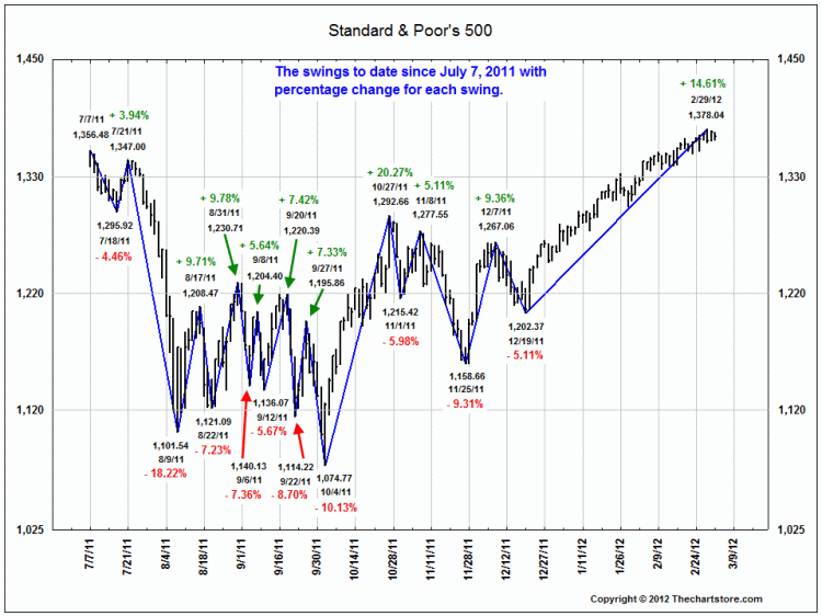
The first is simply a look at 20 separate “swings” of the S&P500, ranging from 4% to 21%, since last Summer:
The second chart tracks the impact of FOMC liquidity actions on equity performance since 2006. Not surprising, there is a correlation between Fed injections and market rallies:
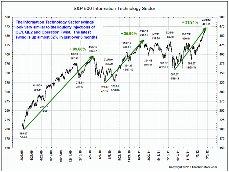
The last chart observes the major Technology rallies since the March 2009 lows. Once again, we see a aparallel between Fed actions and market reactions, with Tech issue being especially sensitive to liquidity.
>

All charts courtesy of The Chart Store


What's been said:
Discussions found on the web: