
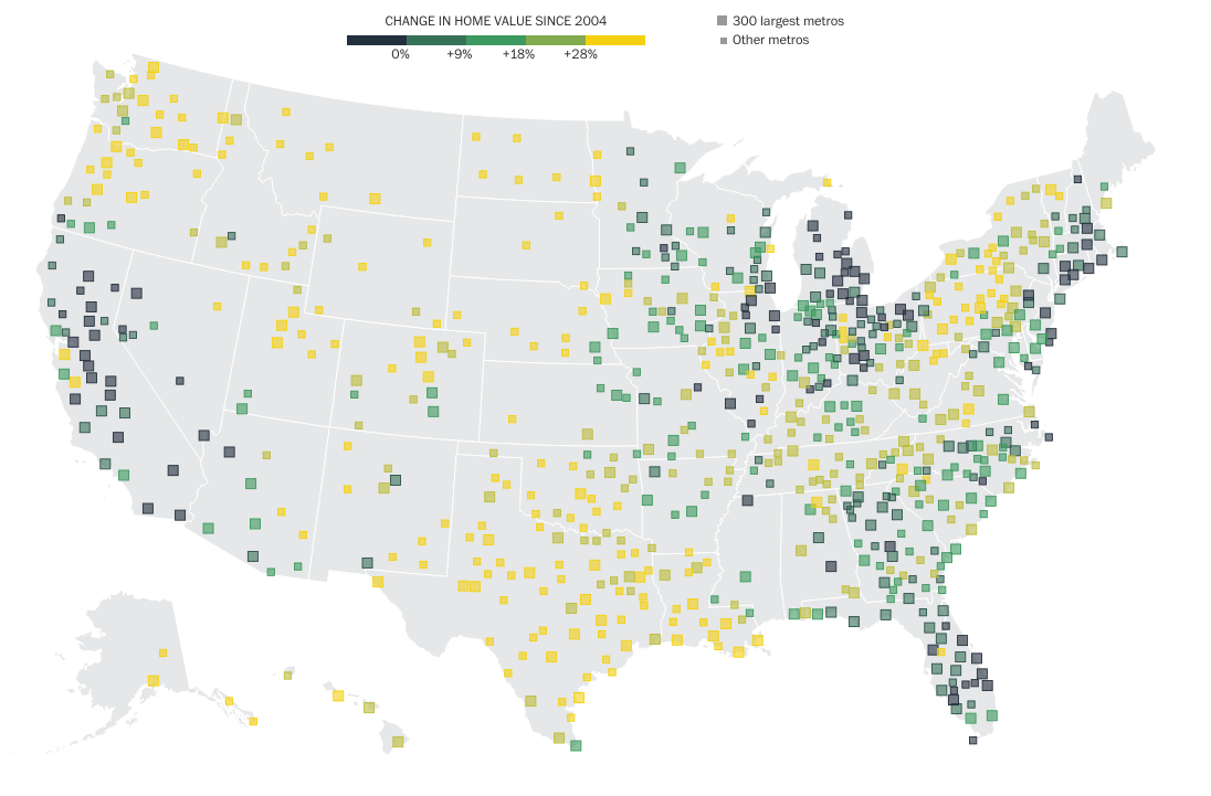
Fascinating analysis and interactive too from the Washington Post, looking at the post-crisis housing recovery. Not surprisingly, it is unevenly distributed. This seems to be be a common aspect of this recovery, or perhaps a broader, secular change in the United States.
Hard to tell of these are the laggards from the bubble doing well, or something else entirely.
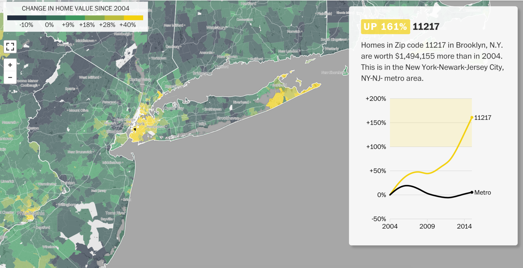
The interactive version, where you can look at a neighborhood by zip code to see how its done is quite amazing — check out Brooklyn and the Hamptons (in Yellow):
Source: Washington Post
