
Source: Edelman Financial Services
This week on Masters in Business, I had a conversation with Ric Edelman.
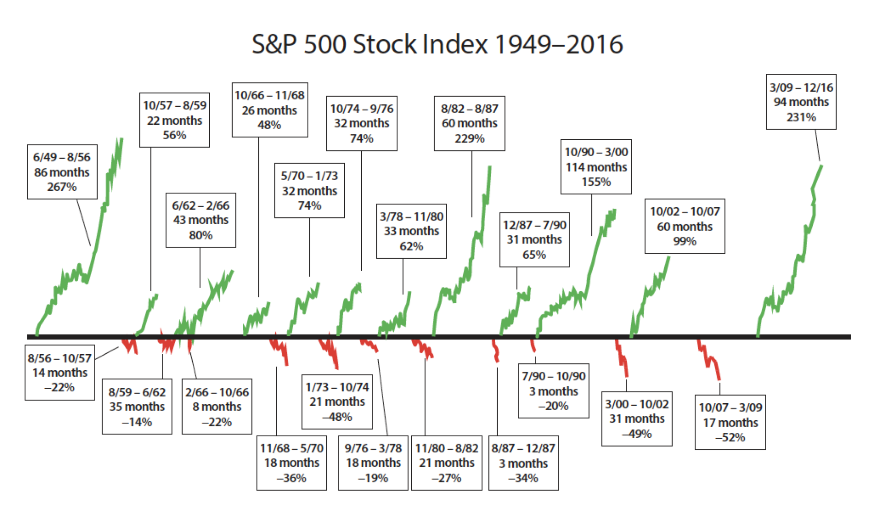
As always, there were lots of questions we didn’t get to — including some of the resources on his corporate website. The chart above is one of my favorites. It shows what market returns look like following a major crash.
The usual caveats apply — post Great Depression took 25 years to return to breakeven, and Japan circa 1989 still needs the Nikkei Dow to almost double to get back to the high from almost 30 years ago. If you were retiring during those periods you were pretty much hosed.
Still, the cyclicality of markets is very worth noting.
