
I love unusual graphics, and this one is as unusual as it gets! Rather than simply go with a map, this graphic designer selected a constant radius circle, with the length/width of each slice of the spiral depicting the impact from largest to smallest. There is a bias towards the larger economies, but that is somewhat moderated by the percentage reading at the end of each plank.
A strange, interesting infographic:
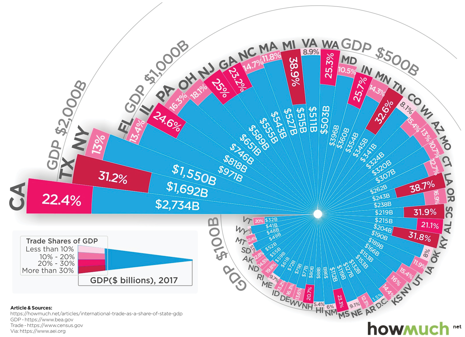
Source: Visual Capitalist
