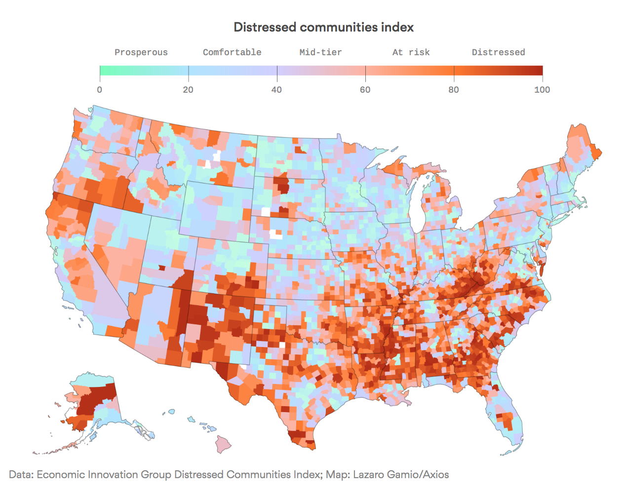
I have for some time now been calling the recovery lumpy uneven, distributed based on industry education attainment and geography. For example, see this, this, this, or this;
The chart above below shows just how true that is — I would be curious as to how the 2016 Presidential vote looked overlaid on this. Was it economic insecurity or something else? I don’t know but I am very curious . . .
click for ginormous map

Source: Axios

