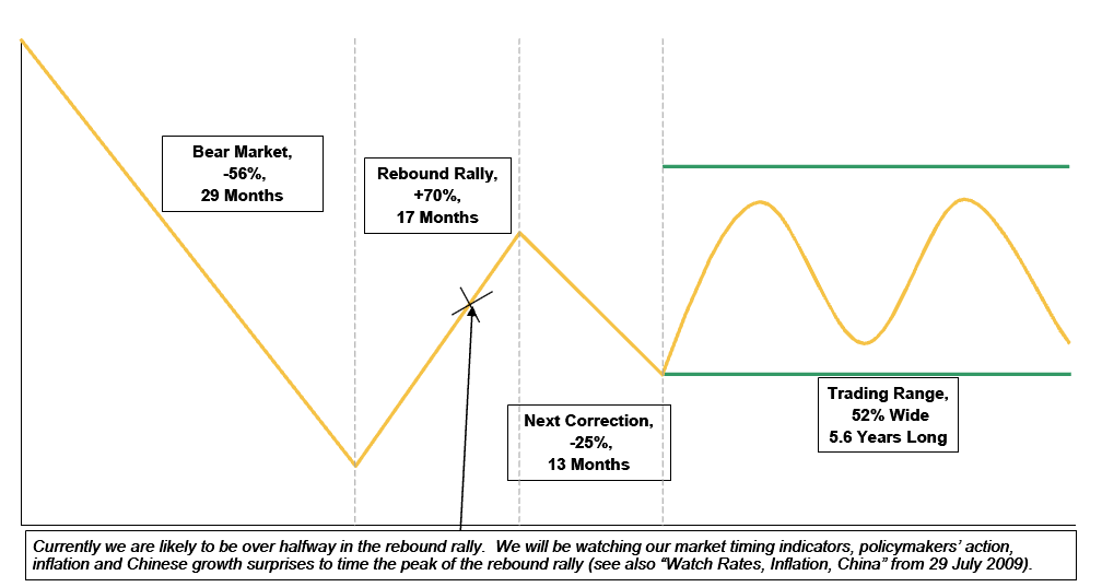
As promised earlier, I pulled up a chart showing the stages of Secular Bear Markets historically.
This fascinating composite chart below is courtesy of the Strategy desk of Morgan Stanley Europe. It shows what the average of the past 19 major Bear markets globally have looked like:
>
Typical Secular Bear Market and Its Aftermath
>
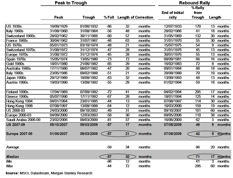
The Chart represents typical secular bear markets based on MS’s sample of 19 such bear markets as shown after the jump.
There are obvious differences and similarities — the SPX fell 43% over 18 months, and snapped back 50% in 6 months. Almost but not quite as deep, but much faster a fall. What that means for the snapback is anyone’s guess.
There is no guarantee that the current market will track that amalgam, knowing what a composite of past Bears looks like can be helpful to your understanding of what is typical.
This table shows Secular Bear Markets and Subsequent Rebound Rally:
>
>
Source:
The Aftermath of Secular Bear Markets
Authors: Teun Draaisma, Ronan Carr, CFA & Graham Secker, Edmund Ng, CFA and Matthew Garman
Morgan Stanley European Strategy 10 August 2009


What's been said:
Discussions found on the web: