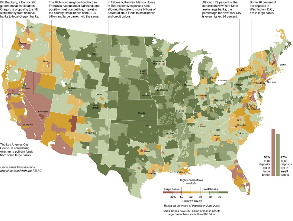
Nice NYT infographic/Map showing the regional differences between bigger (TBTF) banks and the smaller regional banks.
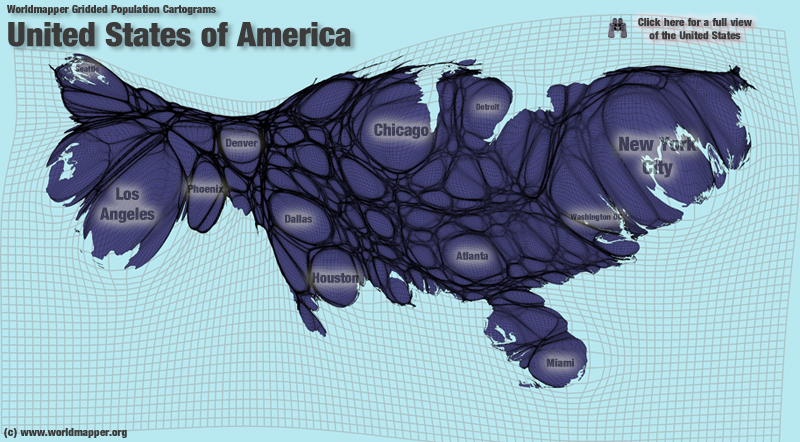
Of course, looking at a map shows you land mass, not population, Most of the non-coastal western third of the country is very lightly populated.
When you look at the map above, you should also consider a cartograph like this:
>

via Worldmapper
The above map is an “equal area cartogram,” also known as density-equalising maps. The cartogram re-sizes each territory according to the variable being mapped.
>
Source:
Metrics A Banking Battleground
NYT, March 7, 2010
http://www.nytimes.com/interactive/2010/03/07/business/07metricsg.html


What's been said:
Discussions found on the web: