Its been a while, so its time for us to take another look at two charts from the fantastic collection of charts via Ron Griess at the Chart Store.
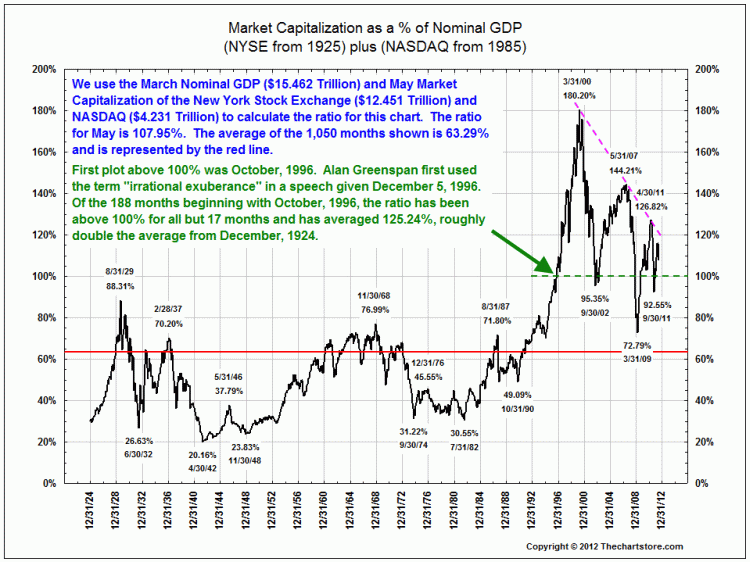
The first simply looks at NYSE + Nasdaq relative to US GDP:
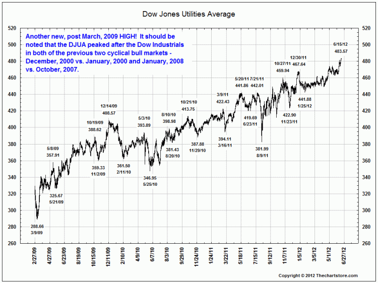
The second chart is noteworthy, as it shows the Utilities average’s recent run (a possible sign of recession?)


What's been said:
Discussions found on the web: