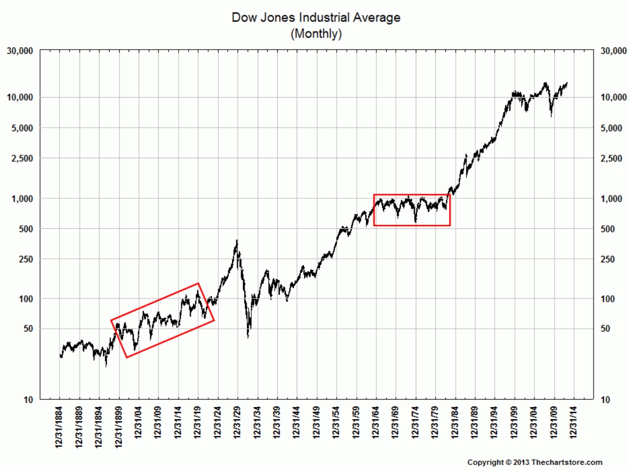
Chartmeister Ron Griess explains why most of the charts of the Dow Industrials that include the 1st few decades of the century are wrong:
“Dow Jones and Stockcharts both have it wrong. Wall Street has been doing it wrong for a long time. I remember Alan Shaw of Smith Barney drawing a similar chart 30 years ago. A good explanation of how to properly account for these changes and splice the two different Dow Industrials in 1914 is here. You can also refer to the book published by Dow Jones called The Dow Jones Averages 1885-1990 edited by Phyllis S. Pierce.”
Here is a short explanatory:
“The start of WWI in July 1914 led tot he NYSE being closed from July 31, 1914 until December 12, 1914. Dow Jones then started a new Industrials Average, and the book gives you both prices. The series most of the erroneous charts use makes it look like the index closed down from 71.42 and reopened at 54.
That is just flat WRONG and any charts drawn from such data are just flat WRONG. Similarly, the S&P 90 was spliced onto the S&P 500 in 1957.
You would n0t use the old values of the S&P 90 (about 370 at the end of 1956) and the new values of the S&P 500 (about 44) to draw a chart. We need to inform the investment community of this problem.”


What's been said:
Discussions found on the web: