
Source: Federal Reserve Bank of St. Louis
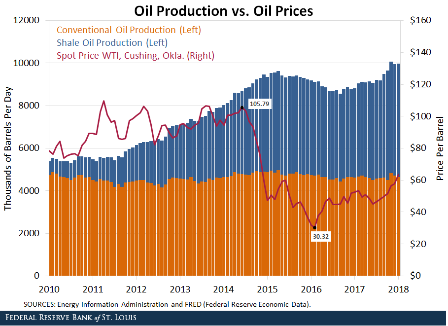
This is an intriguing energy chart, via the St Louis Fed, showing 3 specific items:
Conventional Oil Production
Shale Oil (e.g., Fracking) Production
Oil Prices
What makes this so interesting is that since 2010, the conventional production of oil (orange lines) has remained mostly flat. This remained flattish, even is as the economy in the United Staes, and later Japan, then Europe, then emerging markets, recovered from the GFC.
But over the same period — especially 2010 to 2015 — the supply of oil on the market (blue lines) due to fracking of shale oil exploded.
You can see the subsequent effect of all that supply — it sent prices tumbling.
Now, oil prices have ticked up. The global recovery, while not quite synchronized, no longer has the laggards it did over the past few years. That, plus more potentially disruptive events in the Middle East have contributed to higher prices. With supply high and demand higher, prices have moved up.
The cure for high prices is high prices — meaning, more supply is likely to come on line given Oil around $80 a barrel. Its a key economic commodity, and indicator of demand, and as such is worth watching.
