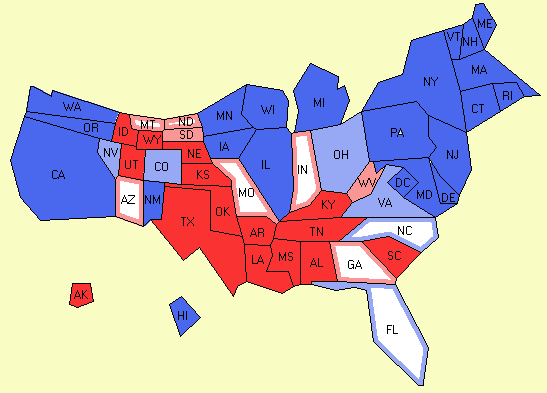
Here is an interesting way to look at the electoral map:
The Cartograph version changes the states so their size is relative to population:

via electoral-vote.com
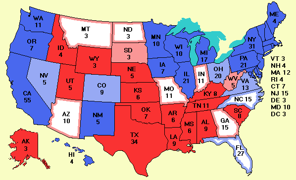
By way of compariosn, here is the classic map. The states on this map are not vote-proportioned, they are geographically-based.

via electoral-vote.com


What's been said:
Discussions found on the web: