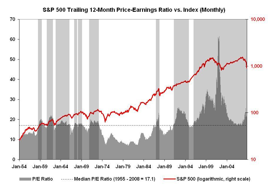
Maybe not, if this (updated) graph of the trailing 12-month P/E ratio is anything to go by…
chart via Mike PanznerNote: This is an update of a P/E Expansion and Contraction chart we first showed back in 2006 — and since so many of you have asked to see this chart updated . . .


What's been said:
Discussions found on the web: