On Sunday, we looked at a charting error in a JPM research piece that compared bank market caps, then and now. It appeared the JPM analyst erroneously selected area rather than diameter in Excel. (Data can be found here).
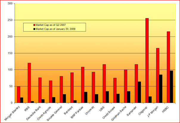
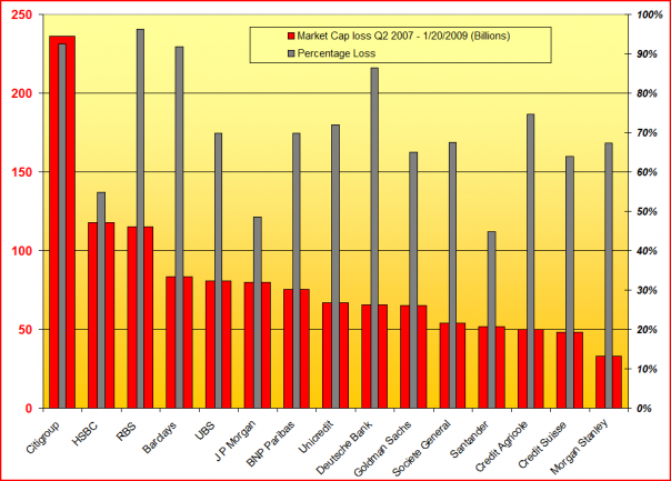
TBP Readers did a nice job taking JPM to school as to what the chart should have looked like:
>
Rene Corda suggested this as the the proper picture:
New & Improved Chart
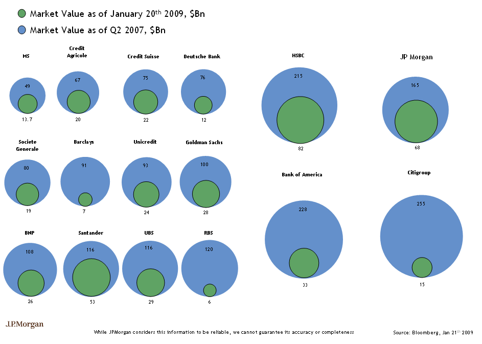
(looks like JPM fixed their own chart)
>
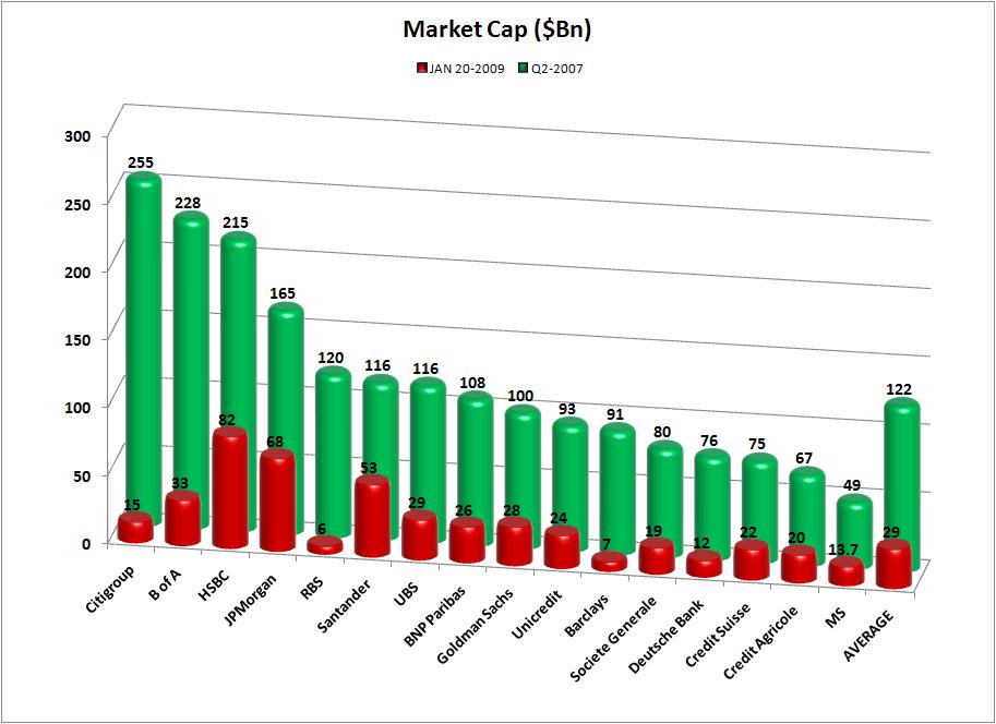
QQQ Trader send this chart along (with averages!)
>
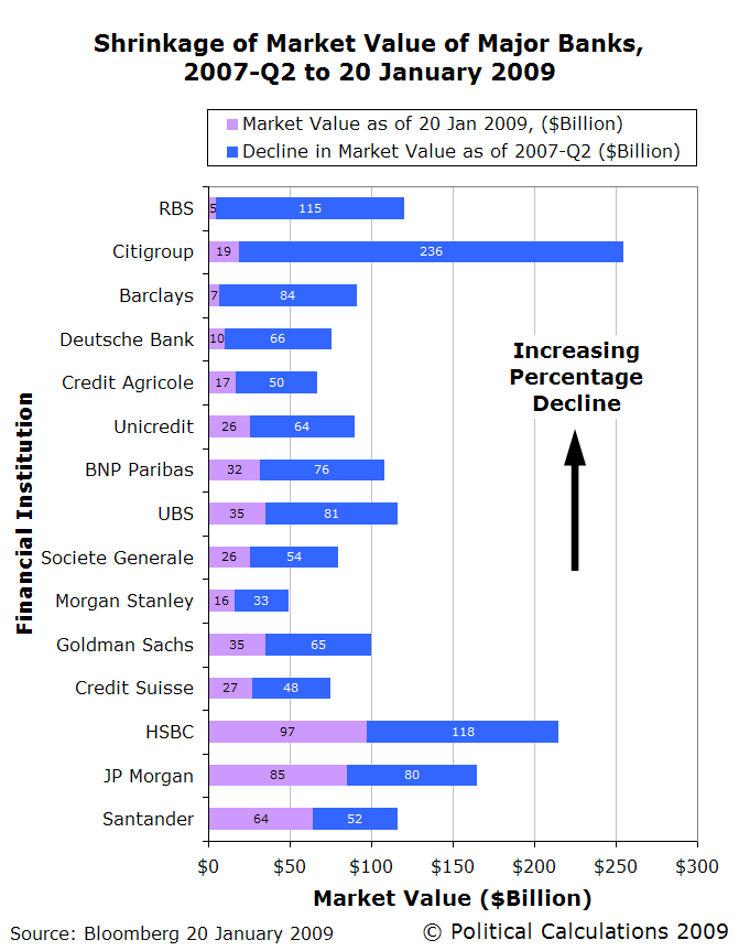
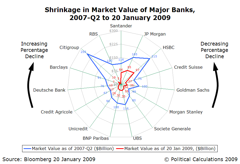
Ironman at Political Calculations gives us these two beauties:
Bar Chart:
>
Radar Plotting Chart:
>
And Mark McHugh of Across the Street came up with these two beauties:
>
>
Source:
Wall Street Can’t Count
Robert X. Cringely
February 12th, 2009
http://www.cringely.com/2009/02/wall-street-cant-count/


What's been said:
Discussions found on the web: