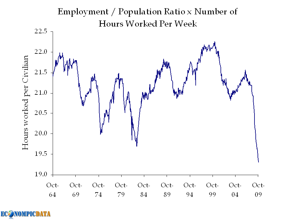
These employment situation reports, courtesyof Jake at Econompic, are simply fugly:
Average Weekly Hours
The hours worked are horrible, even as the Labor pool gets smaller.
These employment situation reports, courtesyof Jake at Econompic, are simply fugly:
The hours worked are horrible, even as the Labor pool gets smaller.

What's been said:
Discussions found on the web: