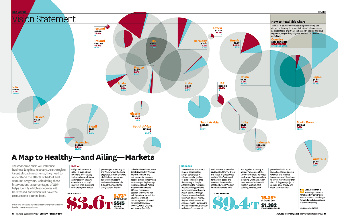
Interesting graphic approach describing the recent crisis from the Harvard Business Review:
Each big circle on the map represents GDP; the 3.6 trillion in Bailouts and the 9.4 trillion in Stimulus are reflected as a percentage of GDP in red and blue respectively . . .
>
>
Hat tip Joe C.
>
Source:
Vision Statement: A Map to Healthy—and Ailing—Markets
Grail Research and de Luxe & Associates
January–February 2010
http://hbr.org/2010/01/vision-statement-a-map-to-healthy-and-ailing-markets/


What's been said:
Discussions found on the web: