Once again, we’ve scoured the intertubes looking for the most interesting, unusual and informative charts about the Employment Situation, to use the BLS vernacular.
Here are 10 of the best of what we found (as always, click for larger charts):
>
Labor Utilization: U3 versus U6 Unemployment
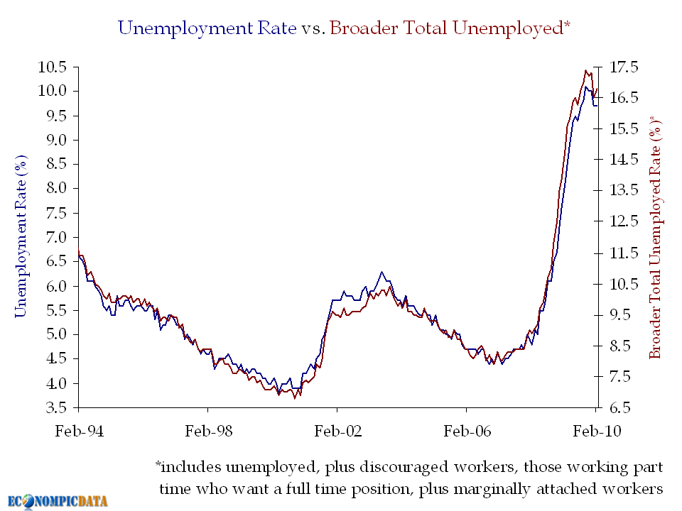
Courtesy of EconomPic
~~~
Monthly Change in Payroll Employment
(1000s)
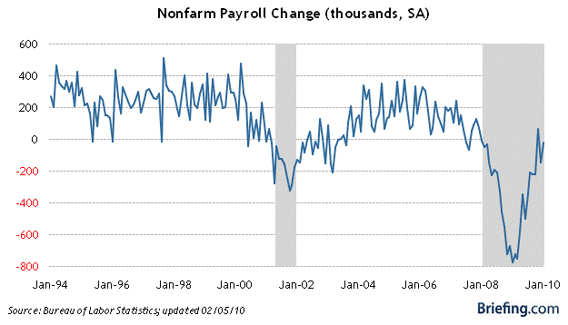
courtesy of Briefing.com
~~~
Unit Labor Cost Relative to Inflation
(82% correlation)
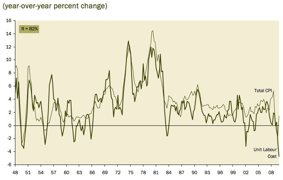
Courtesy of Haver Analytics (David Rosenberg, Gluskin Sheff)
~~~
Unemployment Rate by Educational Attainment
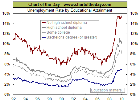
courtesy of Chart of the Day
~~~
Temporary Help Hiring
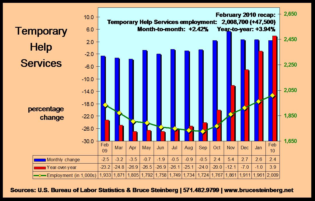
Courtesy of Bruce Steinberg.net
~~~
Some Sectors Show Signs of Life
Courtesy of EconomPic
~~~
Comparing Post WW2 Recessions
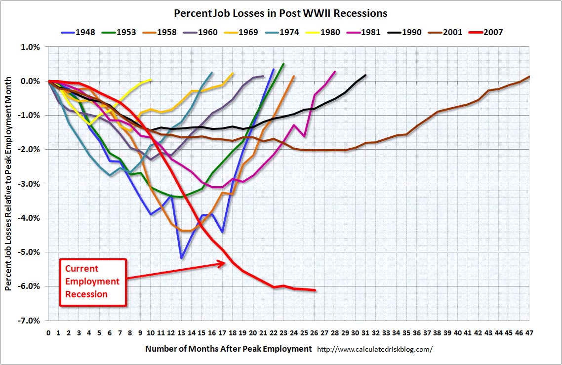
Courtesy of CalculatedRisk
~~~
NFIB Survey Data:
Courtesy of NFIB
~~~
Breakdown of Unemployed by Race, Gender
(Interactive WSJ chart)
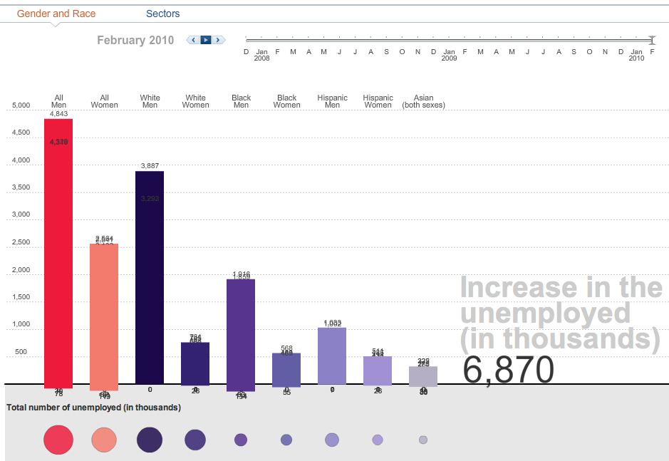
courtesy of WSJ
~~~
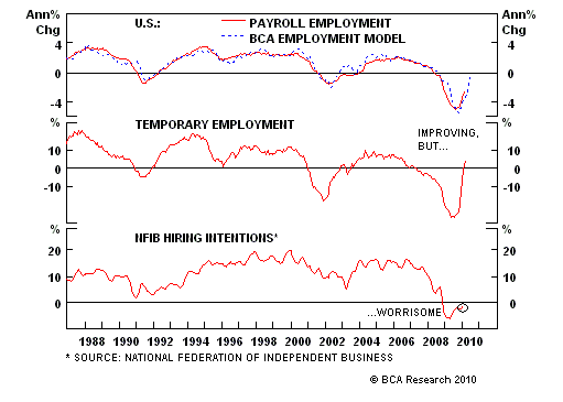
Payroll Employment and Hiring Plans
Courtesy of BCA



What's been said:
Discussions found on the web: