Yesterday was a big NFP release. Today, let’s look at some of the more interesting and unusual chart porn that the data generated:
click for larger graphs
Where Are the Unemployed in the US?
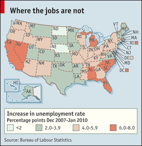
Chart via Economist
~~~
Change in Federal Government Hiring, 1990-2010
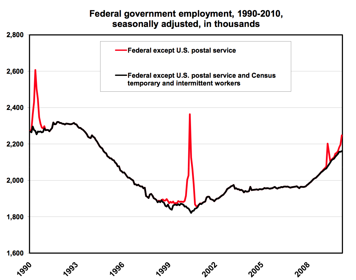
Chart via Clear on Money
~~~
Sector Job Production
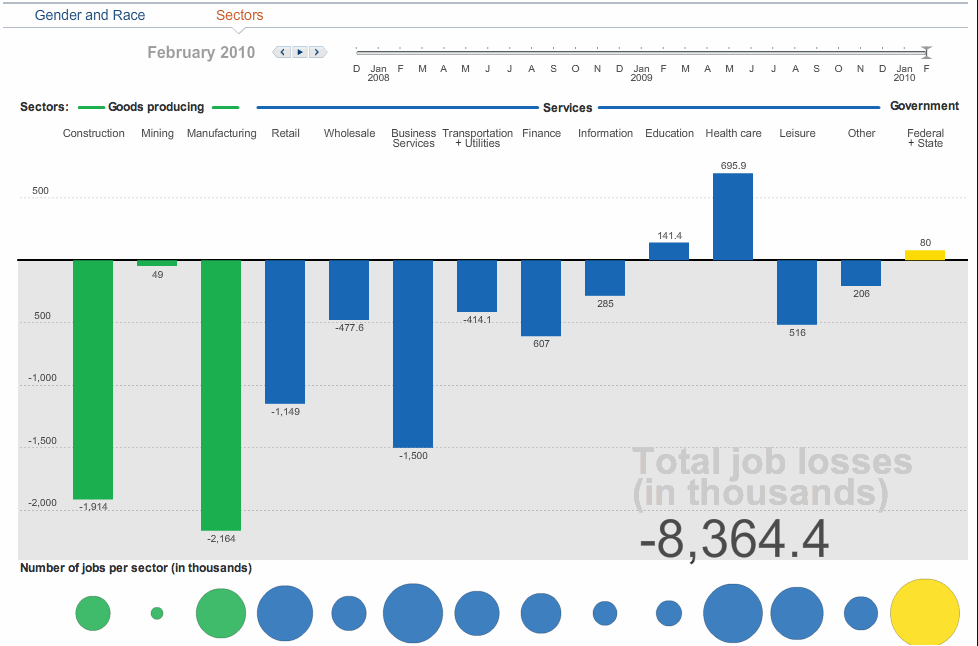
Chart via WSJ
~~~
Employment vs. Population Growth
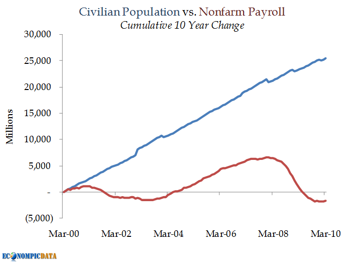
chart via Econompic
~~~
Temporary Help Continues to Gain
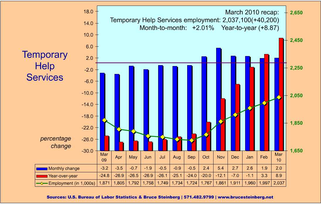
Chart via Bruce Steinberg
~~~
Different Eras of Recession Recovery
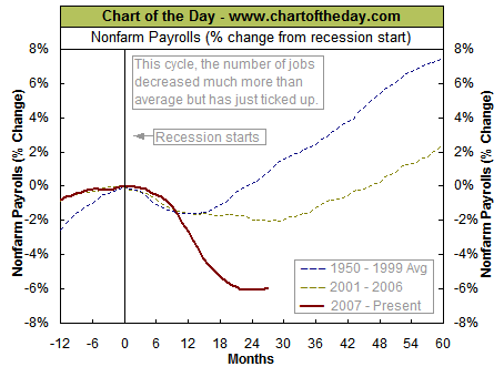
Chart via Chart of the Day
~~~
Post-WWII Recession Recovery Periods
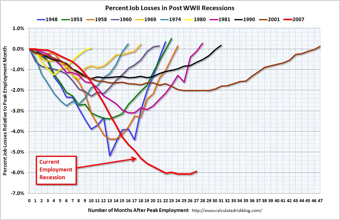
Chart via Calculated Risk
~~~
Monthly and Annual NFP Changes
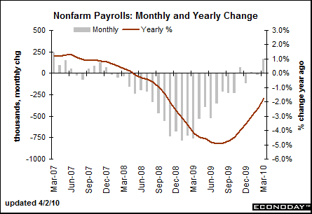

Chart via Barron’s Econoday
~~~
Another version of Monthly Change in NFP
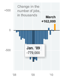
Chart via NYT
~~~
Unemployment by Duration
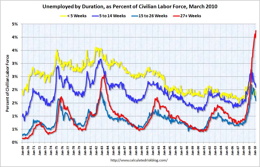
Chart via Calculated Risk
~~~

Chart via Detroit Free Press
~~~
Monthly Unemployment Data, 1950 to Present
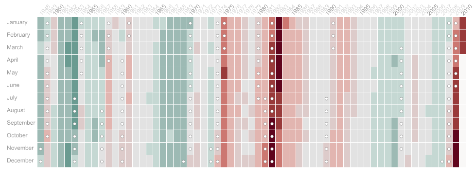
Chart via WSJ


What's been said:
Discussions found on the web: