I keep hearing from people that this is not the typical economic recovery. But I don’t see that at all — at least in terms of Consumer behavior.
We had 25 months of economic contraction with horrific headlines the whole time. Spending decreased, savings increased, unemployment spiked. This led the government and central bankers to throw lots of money at the problem — not so much fixing it, as papering it over.
Certainly, the cause of the recession was not the usual run of the mill factors. Nor was depth or duration. However, it appears — at least according to the charts I see — that this recovery is following a fairly normal script.
Then, a recovery began.
Many people doubted it, recent painful memories being so fresh.
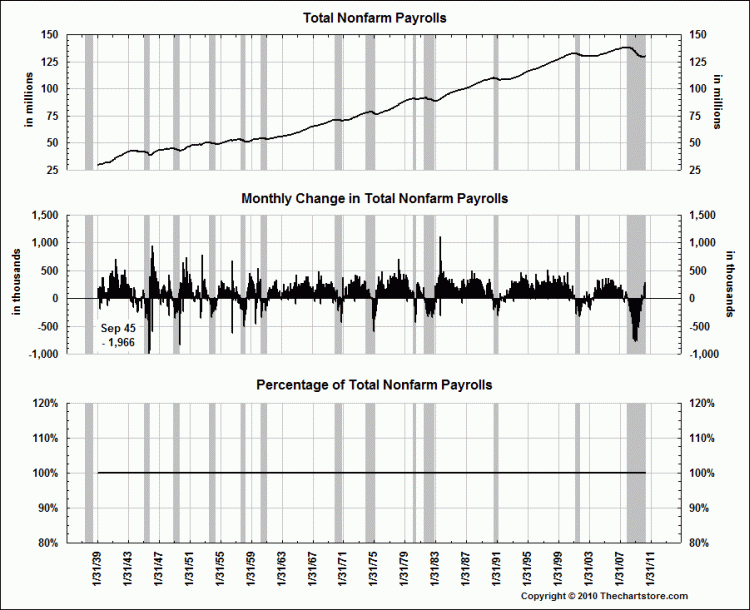
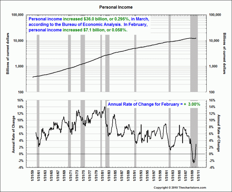
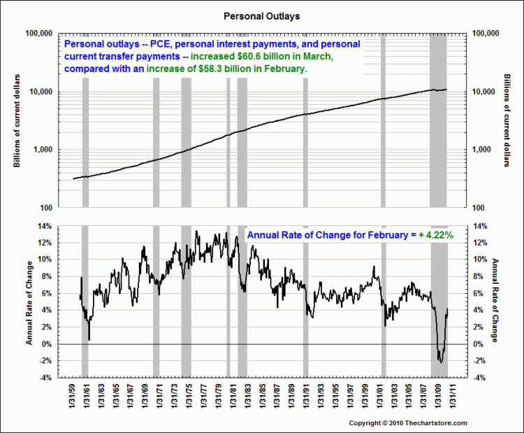
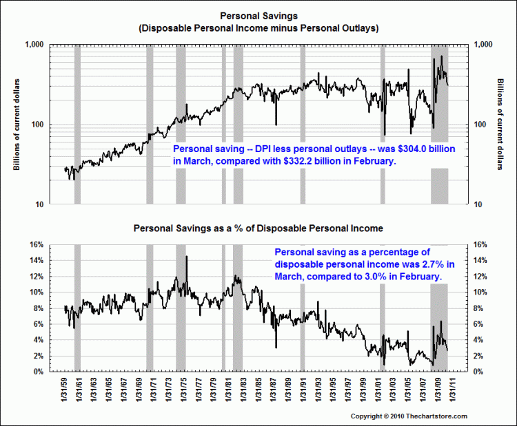
But have a look a the charts below — when I look at year over year changes in areas such as spending, income, jobs — this looks like a typical recovery in hiring, etc.
Isn’t that is typical recession/recovery behavior?
-People hunkered down, and slowed spending.
-Market discounted the recession partially.
-Unemployment increases.
-Consumers get nervous, spend less, save more during the contraction.
-Economy bottoms
-Markets discounted the recovery.
-Employment picks up
-As signs of improvement become visible, consumers started spending again.
The consumer response to economic stress was — pardon the word — typical. 1973, 1982, and 1991 saw similar hunkering down, then a return towards normalcy.
UPDATE: May 12, 2010 5:54pm
In the 4 charts I referenced, I was looking at factors impacting and reflecting consumer behavior.
This came up in a discussion with a hedgie friend as a follow up to the Mortgage Defaulters are driving retail sales. I wanted to see if this was in anyway an out of the ordinary consumer recovery. The charts imply that it is pretty typical.
Now, all of the surrounding factors — the credit bubble, market crash, bank collapse, TARP, the RE boom & bust, ZIRP, etc. were highly unusual.
But the human response to the end of the recession seems rather ordinary . . .
~~~
Charts after the jump
All charts courtesy of The Chart Store.
Click for larger graphs


What's been said:
Discussions found on the web: