Here is a decidedly contrarian viewpoint, from University of Alabama Professor Dr. Roy Spencer.
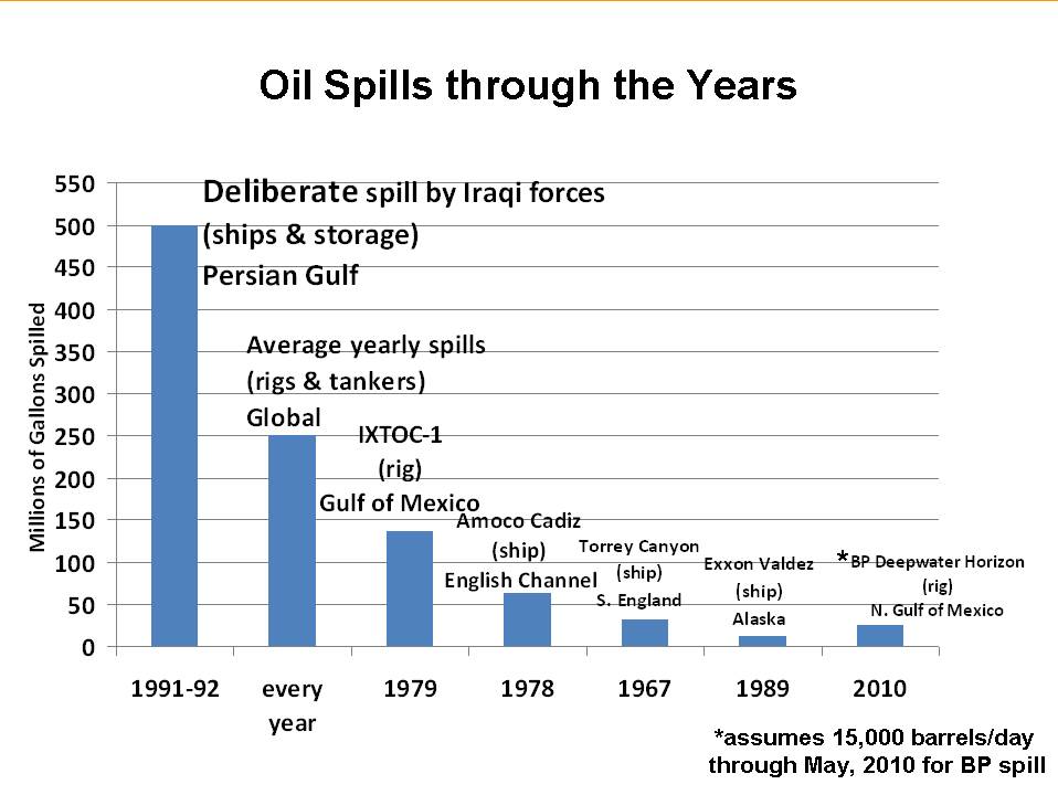
Prof Spencer notes that the general commentary regarding the BP spill as “the worst environmental disaster in history” is wildly overblown. His graph below is designed to put this spill into perspective.
Now, before you wail that he is a global warming crank — he claims “global warming is mostly natural, and that the climate system is quite insensitive to humanity’s greenhouse gas emissions” — I have a serious question about the chart below. Is it true? Does it accurately portray the state of global oil spills?:
>
>
Assuming it is accurate, the chart itself is intriguing — and should touch off a broader discussion of Oil production and usage.
Note: I know I am going to get bombarded with emails about Spencer. Regardless of whether he is an industry hack, a science denialist, etc. (and he more or less is), I am referencing his data, not him. Unless you can demonstrate that the data underlying the chart is false, the rest of his background is irrelevant.
If his data is accurate, then the above is a fascinating chart . . .


What's been said:
Discussions found on the web: