I (Invictus) posted here about a debate in which David Rosenberg squared off with Jim Grant about whether “bonds are for losers” or if, as Dave likes to quip, “bonds have more fun.” At the time of the debate the 10-year was hovering around 4%. At the time of my post it was about 3.4%, and is currently around 3.20%, give or take.
Among the bond-bullish arguments Rosie makes is an analysis of the $68 trillion household (and nonprofit) balance sheet and what, exactly, households (and nonprofits) own (all this data is captured in Table B.100 of the Fed’s Flow of Funds report, released last week).
Here is a pie chart showing the relative insignificance of treasuries and munis on the household balance sheet:
>
>
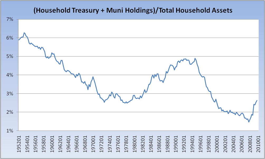
For some historical context, below is the percent of treasuries plus munis as a percent of total household assets for the last 58 years. It bottomed at the end of 2007 and has been on the rise since. So the argument can be made — and it’s one that Rosie makes — that although there has been plenty of supply, there should be sufficient demand to soak it up. Parenthetically, I’d note that demographics — back to that aging boomer population — lend support to the argument that demand for treasuries should remain adequate (as coming higher tax rates argue for support of the muni market).
Adding a question to those who insist that bonds are in a bubble and that interest rates must go up:
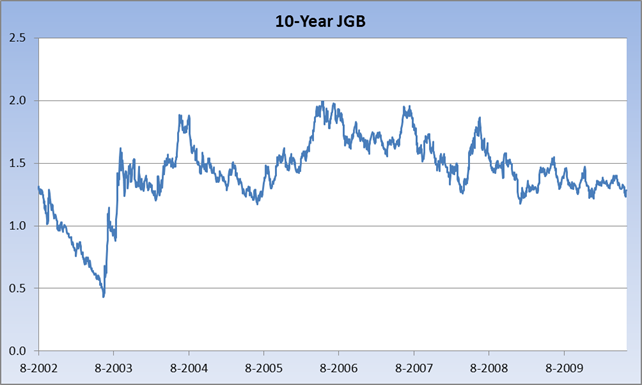
Below is a chart of 10-year Japanese bonds (JGBs) for the past eight years, which is all the Ministry of Finance website has. Why is it a foregone conclusion that our experience must be different than theirs? Seriously. What are your thoughts?


What's been said:
Discussions found on the web: