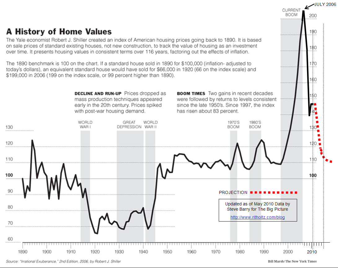
Back in 2008, I ran this updated chart of the Case Shiller Housing Price Index by BP reader Steve Barry. It was widely reproduced around the web. (Unfortunately, some unscrupulous folks striped Steve’s authorship off of it, and passed it off as their own).
I asked Steve to update Shiller’s NYT chart, now that much of the government intervention has run its course. There is still massive Federal Reserve subsidies in the form of record low rates. But the short term bounce caused by HAMP, Foreclosure abatements and first time home buyers tax credits are mostly over.
Here is Steve’s chart:
>
click for ginormous graphic

Chart courtesy of the NYT, as modified by Steve Barry
>
Previously:
Classic Case Shiller Housing Price Chart, Updated (December 30th, 2008)
A Closer Look at the Second Leg Down in Housing (June 24th, 2010)


What's been said:
Discussions found on the web: