@TBPInvictus here, gang.
Is it possible that Dickens was trying to reconcile two seemingly conflicting charts of the labor market when he penned that famous line?
We’re all reminded, month after tedious month, that this is the mother of all jobless recoveries. One of the charts I have seen used most widely appears every month over at the most excellent Calculated Risk website (first chart in post at link). I get sick just looking at it. Bill’s chart is, of course, accurate (sickening though it may be). Other such charts and graphs have proliferated, and most discuss job losses since the onset of recession in December 2007, or something to that effect. David Rosenberg has frequently mentioned the hideousness of the job market “xx months since the recession’s start.” And he, too, is correct.
Here’s how one media report put it:
By almost every measure, the economy has been expanding at a healthy pace for six months. But the nation’s employers remain stubbornly reluctant to add jobs in the United States. […] Another [reason for lack of hiring] is rising productivity, squeezing more work from existing staff and other efficiencies. […] Despite strong economic growth since last summer, the current recovery started out very slowly and that helps to explain the lack of hiring.
That report, from the NY Times, is dated March 6, 2004, fully three years from the onset of the 2001 recession. And there’s this post’s “the more things change” reference.
If the economy is in recovery — a new cycle — for the the past 13 (or so) months — “technical” or not — should we perhaps be looking at the employment situation relative to the trough now, and not to the last peak? To be clear, I am not advocating hard one way or the other (though I will offer some thoughts in closing), simply pointing out that if the recession ended — as many, including the St. Louis Fed (see: Dude, Where’s My Recession Bar, Jan 2010, and St. Louis Fed Tracks Nascent Expansion, Mar 2010) — perhaps we should now be looking at our experience from the trough? This is more my offering an item for discussion than taking a stand on the issue — both sides have valid arguments.
Both of the following statements are true, and neither contradicts the other: We experienced the worst labor market recession since the Great Depression. From the trough, the labor market is generating jobs at a faster pace than the previous two recessions.
Let’s get to the topic of what date is used as the peg from which to measure. Here are the relevant charts, but first a few notes:
1) To avoid running into census worker issues, I have chosen to use Private Sector payrolls (USPRIV at the St. Louis Fed). We’ll keep the government out of this and focus on the private sector. Makes the comparisons apples-to-apples, as census was not at play in 2001 or 1991.
2) Y-axis scales on the two charts differ slightly and are set to best show changes.
3) BR stole a bit of my thunder by posting Kasriel’s related chart in a recent post, as it drives home a similar point in a totally different context (i.e. Boskin’s a lying sack of shit). For the record, my post was a work-in-progress at that time and in no way a result of the Kasriel post.
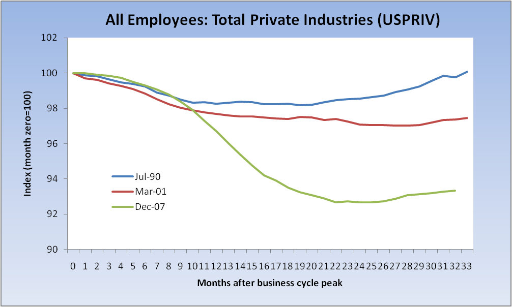
So, first let’s look at a chart indexed to 100 at the beginning of the past three recessions (and below that a chart indexed to their ends, two of which we know, the last we assume) — 2007, 2001 and 1990. Immediately below is what is generally seen floating around in various iterations and has become the de facto representation of the job market. Many charts show more recessions, or averages, or maximums and minimum. I’m focused on 2001 and 1990 because they defined modern-day “jobless recoveries” and are thus the appropriate choices. (It occurs to me that the phrase “jobless recovery” itself, by definition, arguably demands that we focus on the “recovery” and not the “recession,” or we would name it otherwise.)
True claim: “This is/was the worst job market since the onset of recession since the Great Depression.”
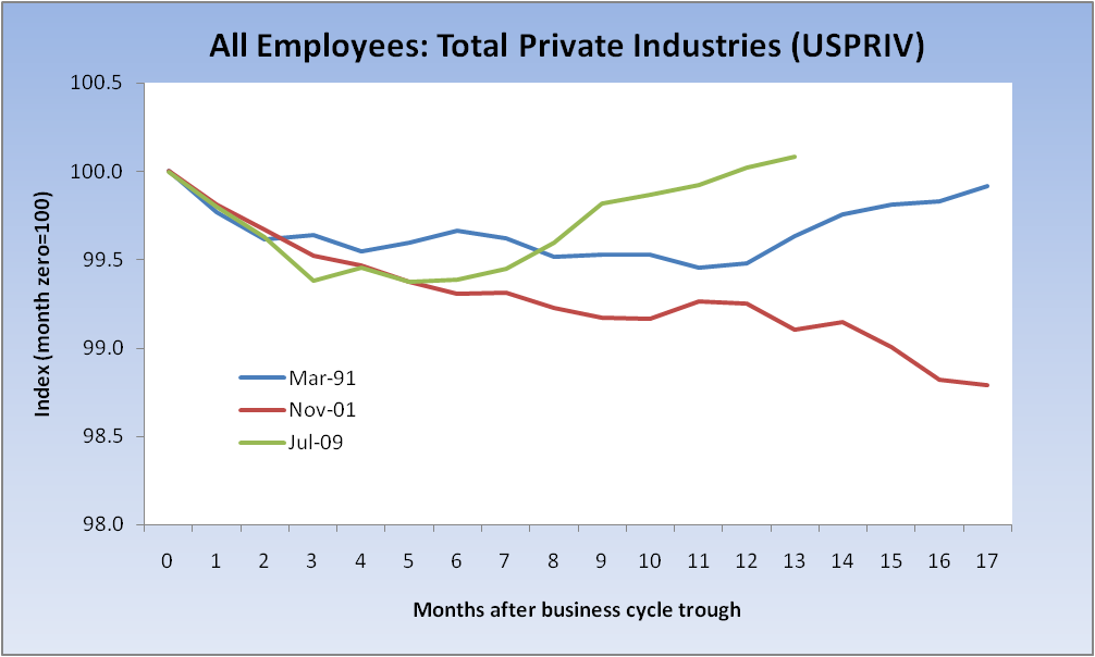
Now let’s have a look at labor market performance from business cycle bottoms, and I’ll offer the following question: Is this the more relevant yardstick at this point in time?
True claim: “The labor market’s recovery since the trough is better than in the last two recessions.”
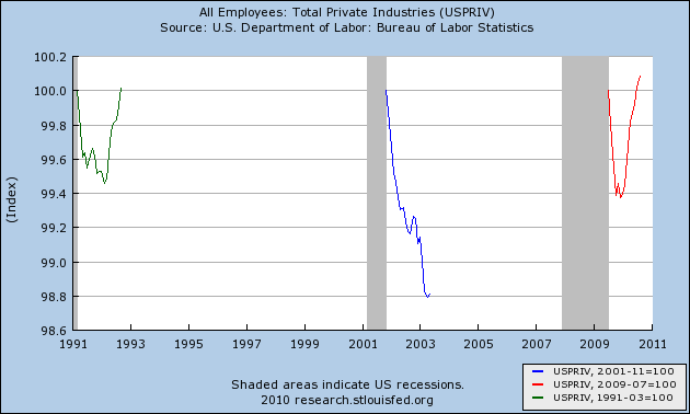
Here’s another representation, again from the troughs, that clearly drives home the point:
Let’s talk for a moment about the .300 hitter who goes into a woeful 2-15 (.133) slump (actually a bit better than Derek Jeter’s current 8-66, as of Saturday night). That fact would surely be picked up on by the media. When he subsequently goes 10 for his next 22 (.455) that, too, would be noteworthy. His overall 12-37 puts him at his .324 average, but he hardly got there in a straight line. Now, I’m not suggesting that we’ve just gone 10-22, but I would argue that perhaps we no longer need to talk about the 2-15, and that doing so might be counterproductive.
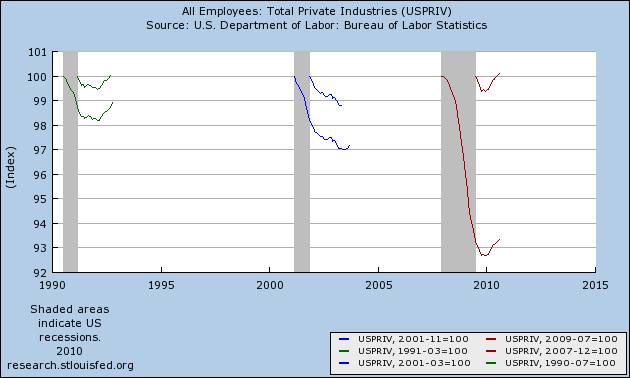
One last bit of chart porn that highlights the notion that it was the steepness of the drop, and not necessarily the pace of the recovery, that’s the real issue here (this is simply the chart immediately above with peaks added to the mix):
One inference (mine, as promised): Although we experienced the worst job-loss recession since the Great Depression, this has not been as job-less a recovery as many would have us believe. It is demonstrably better than the past two recessions as measured from the trough. Put another way, the labor market was in the deepest ditch it had been in for some 80 years and, given that, is actually doing a fairly reasonable job of climbing out, though the pace simply must accelerate if we are to recover all the jobs we lost in any reasonable time frame (and I can’t stress that final point enough).
If I were going to make a political point, I’d probably be inclined to say that, given the shallow nature of the 2001 recession, the Bush administration’s record in its aftermath was woeful. But let’s not go there.


What's been said:
Discussions found on the web: