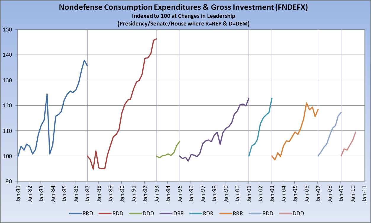
In the comments of my recent Hey, Big Spender post, some readers took me to task because “Congress controls the purse strings” and it was therefore unfair to look at spending by President.
It may make more sense to break this down into rates of spending increases by congressional (2-year) intervals. Fortunately, these divide evenly into presidencies.
I think it would be even more powerful to break out periods of time where power was split i.e. where a Republican was in the white house but the democrats controlled Congress.
It’s a fair enough point, and we here at The Big Picture are nothing if not intellectually curious and reader-centric. So here is a chart addressing that point (FRED version is here). I’ve indexed Nondefense Spending to 100 at each change in control of the White House or either house of congress.
Sources: St. Louis Fed, About.com
My takeaway from this is fairly straightforward: Democrats have never much claimed the mantle of fiscal responsibility. And they don’t deserve it. Republicans have made that claim, and they’re making it again now. But they don’t deserve it, either.
Interestingly, just a scant couple of hours before this post was to go live, I could not help but laugh when I saw the following headline at the NY Times website: “As G.O.P. Seeks Spending Cuts, Details Are Scarce.” Scarce indeed. One look at the chart will tell you it just ain’t gonna happen.
ADDING: Bruman has done a really nice job taking this one step further here. Thanks.


What's been said:
Discussions found on the web: