One of the more fascinating things about the monthly Employment report is the slew of charts it generates.
No one site or media outlet has a monopoly on interesting visual depictions of the employment situation. We have an embarrassment of riches, a virtual orgy of chart porn, and I could have included dozens more.
There are my top 10 favorites; as always, click to max out the image:
>
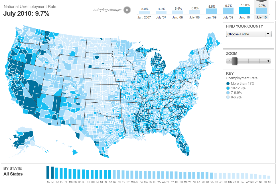
Unemployment by County
>
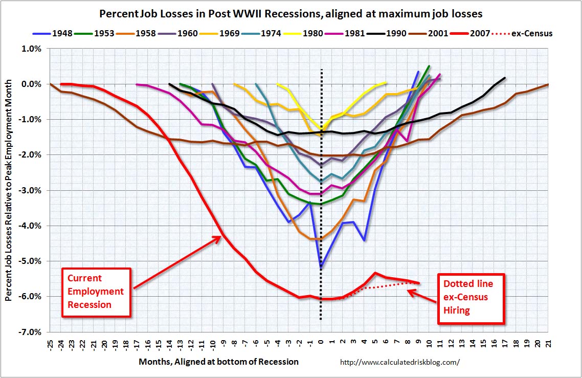
Comparing Post WW2 Recession Job Losses
>
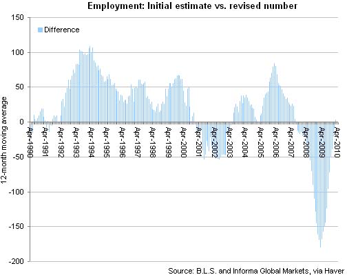
BLS Employment Revisions
>
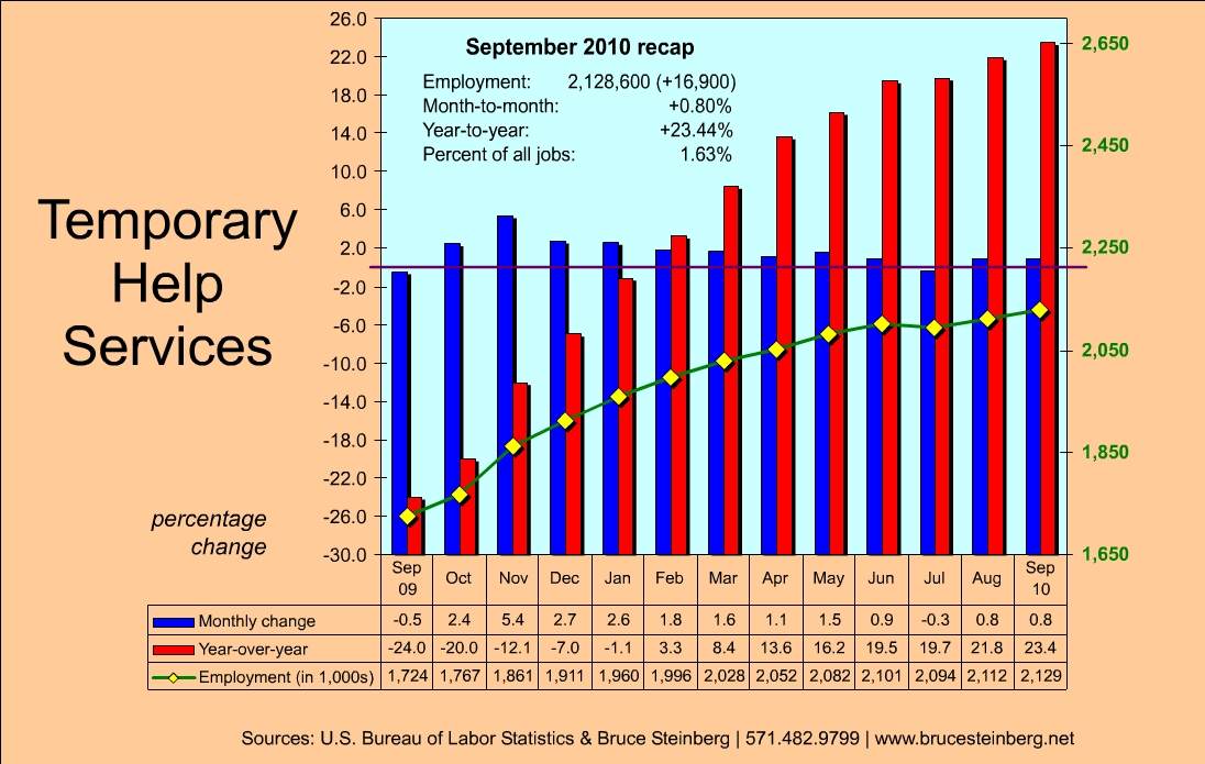
Changes in Temporary Employment
>
Jobless Recoveries: 1980 – Present
>
Recession Recoveries: 1980 – Present

Economix
>
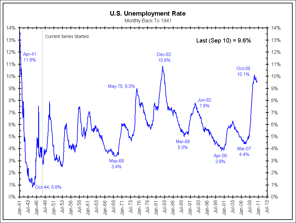
US Unemployment Rate
>
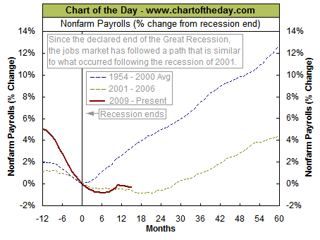
Recession Comparisons (1954, 2001, 2009)
>
ADP vs BLS Employment Data
>
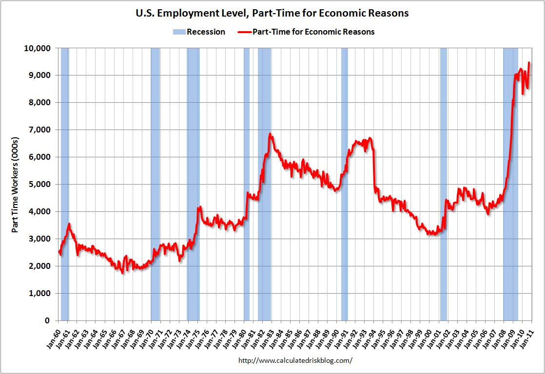
Part Time for Economic Reasons
>
Did I miss anything particularly interesting? Let me know in comments . . .




What's been said:
Discussions found on the web: