A 9.6 percent unemployment rate is flat-out unacceptable. That it has only come down 0.2 percent from last year’s 9.8 percent is also unacceptable (vs. Sept 2009). The Fed’s mandate is to “maintain long run growth of the monetary and credit aggregates commensurate with the economy’s long run potential to increase production, so as to promote effectively the goals of maximum employment, stable prices, and moderate long-term interest rates.” Herewith a look at a couple of relevant factors and some comparisons to the historical record.
How Big Was The Hole?
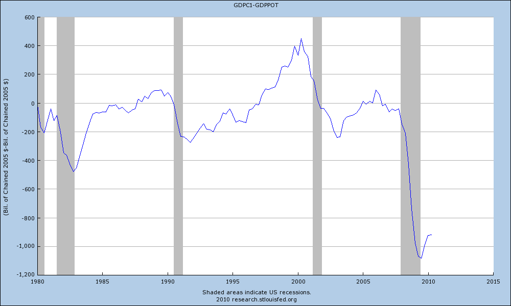
Estimates generally coalesce around an unprecedented $1 trillion dollar output gap. Best I can represent, that number is derived by simply subtracting Real Potential GDP from Real GDP. It’s a larger hole, by some $600 billion, than the $479 billion we saw in 1982. That trillion dollar hole is what the incoming administration faced in the early months of 2009 (it’s still just over $900 billion).
(Click through all charts for ginormous.)
Putting Unemployment in Context
Given the gaping hole that opened up between what our economy can produce and what it did produce, it’s hardly startling that the unemployment rate spiked. Let’s have a closer look at the unemployment rate and put it in some historical context. I reiterate, and cannot stress enough, that a 9.6% unemployment rate — ~15 million unemployed Americans — is wholly unacceptable.
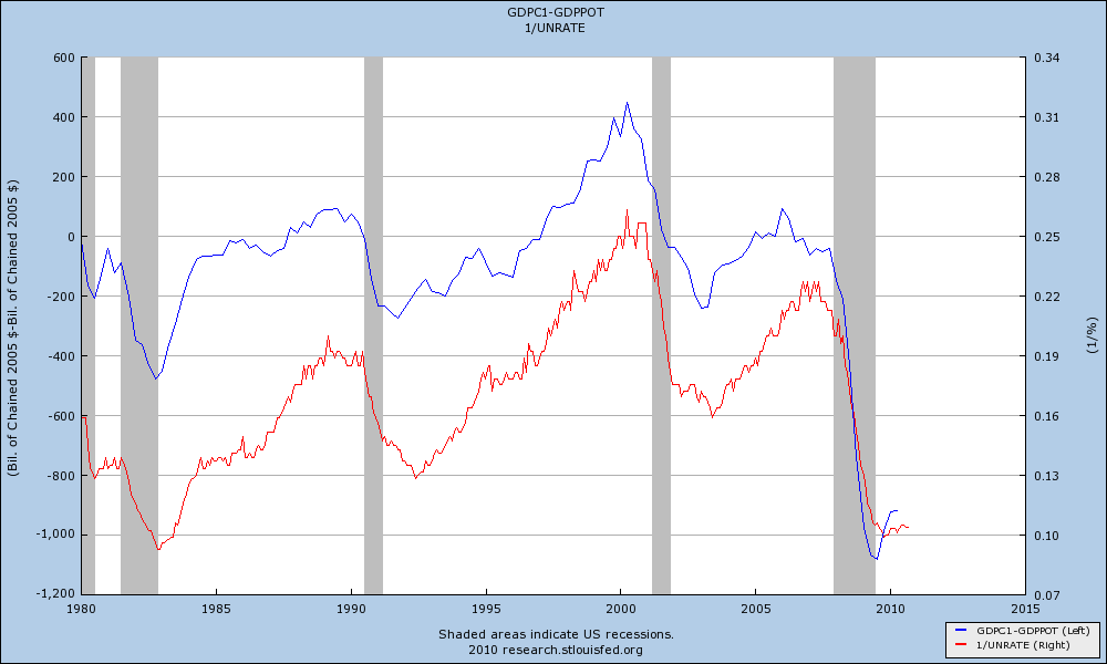
The trajectory of the unemployment rate closely tracks that of the spread between GDP and Potential GDP, as shown below. [NOTE: I have inverted the Unemployment Rate to clearly show its correlation to the GDP/Potential GDP spread. Consequently, the numbers on the right-side axis, 1/UNRATE, are not relevant; it’s the correlation that is.]
It seems to have been forgotten that unemployment did not peak until 19 months after the November 2001 trough and 15 months after the 1991 trough. In the current recovery, if we do not drift above the previous high of 10.1 percent (Oct. 2009), we will have peaked four months after the recession ended. The table below tells the story:
| Recession Ends | Unemployment Peaks | Months |
| Nov-1982 | Dec-1982 | 1 |
| Mar-1991 | Jun-1992 | 15 |
| Nov-2001 | Jun-2003 | 19 |
| Jun-2009 | Oct-2009 * | 4* |
*Remains to be seen, but is the current reality.
Now, a little while back I highlighted the fact that Private Payrolls (USPRIV at FRED) — indexed to 100 at economic troughs — has been tracking at a better pace than after the end of the last two recessions. That post was a bit controversial, supported in some corners and criticized in others, presumably because it was perceived as pro-Obama. (Facts have a well-known liberal bias?).
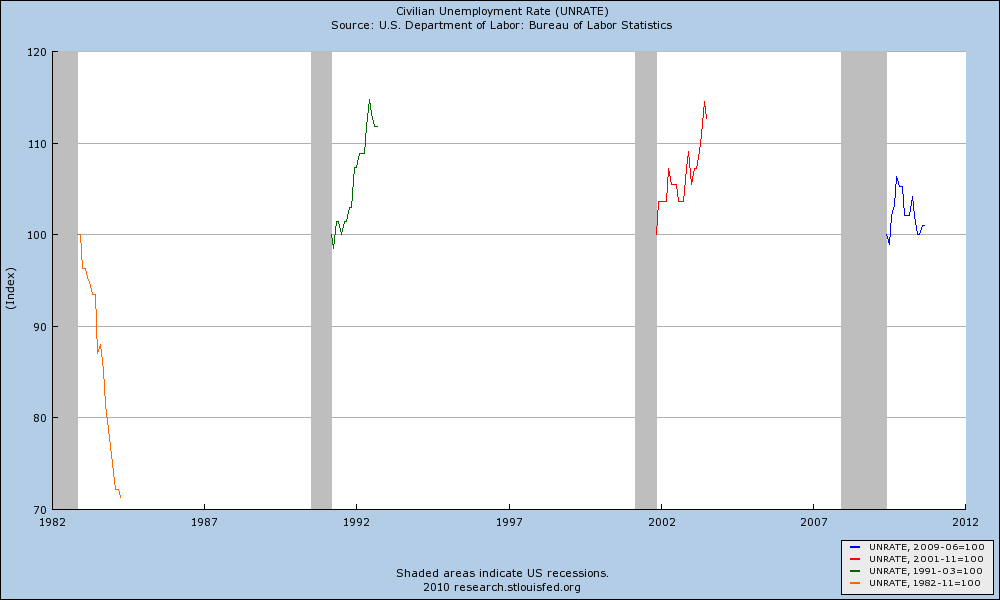
So, in that vein, here we go again with my new favorite FRED feature. Let’s have a look at the Unemployment Rate — indexed to 100 at economic troughs — for the past four recessions:
What we see is perfectly consistent with the data in the table just above. In 1982, the Unemployment Rate began to decline coincident with the end of the recession. In 1991 and 2001, it continued to rise. Since June of 2009, it continued to rise for a few months and then began to descend.
Now, to be crystal clear (again): None of this is to say that a 9.6 percent unemployment rate is acceptable. It is not. And the Fed, the President, and Congress need to do all they possibly can to bring it down more quickly. However, relatively speaking — after all, indexing lets us level the playing field and make apples-to-apples comparisons — although we are struggling mightily, it would appear for the time being that we are at least holding our ground. That’s a far cry from doing well — and we need to do better — but at the moment we’re not (yet) backsliding and there is some small amount of comfort to be taken from these comparisons.


What's been said:
Discussions found on the web: