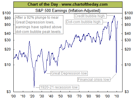
With 96% of S&P 500 companies having reported for Q3 2010, the COTD provides some long-term perspective as to current earnings.
By focusing on 12-month, S&P 500 earnings 9as reported), the chart illustrates how earnings plummeted 92% from its Q3 2007 peak to Q1 2009 low. This brought inflation-adjusted earnings to near Great Depression lows.
Ahhh, how times have changed: Since its Q1 2009 low, S&P 500 earnings have surged 900%. They are now at peak dot-com bubble levels. The only time earnings have been higher than current levels for a 29-month stretch that occurred at the tail end of the credit bubble.


What's been said:
Discussions found on the web: