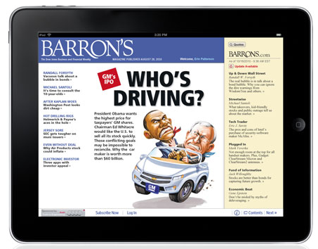
I’ve been playing with the Barron’s iPad app, and I can tell you this: It is vastly superior way to consume the weekly magazine than either the print or web version. The app is free, but you need a subscription to access it, unless you buy single issues.
I have been very critical of Rupert Murdoch for politicizing/de-financializing the Wall Street Journal, but the WSJ app is the best I have seen for consuming media period. The Barron’s app is not too far behind.
Like the Journal’s app, the Barron’s app has a small menu on the bottom right edge of the iPad. The part marked Sections is the key menu item — touch it, and you have a choice of Cover, Features, Columns, Market Week, Review, Preview Barron’s.com and Archive. This is nearly identical to the way the WSJ app works.
Key sections:
-Cover is the full graphic of the cover;
-Touch that and you get the cover story. Its part of the Features, section. Showing up in the right hand column are all of the Feature stories headlines. You can swipe through them one by one, or touch the headline in that column for the full story.
-The Columns behave the same way — Abelson, Santoli, etc. Touch any story, and the same 90/10 split of the screen occurs. The article shows up in the left, with the right hand column containing the full list of articles from that section, all accessible by a single touch.
-MarketWeek gets its own section with the same rules as Features and Columns.
I have only been playing with this for a few days, but I have 3 criticisms of the app:
1. The entire front cover should be interactive — but it isn’t; Touch anything on the cover, including other headlines or photos, and you only get taken to the cover story.
2. Where is all of the Market Data Center I can access with the online version?
3. No video!
Note that the WSJ app does not have a separate video section, but embeds related video into many articles. I assume that Barron’s will have that capability eventually. Given how much Dow Jones is spending on video production, I am surprised they did not build video its own dedicated section in these apps.
Like the Journal, the Barron’s app manages to deploy the best of both worlds. I used to read Barron’s cover to cover early in my career, dragging it on the train during the 1st few days of the week, but its sheer bulk was an impediment (I eventually stopped that madness). The online version isn’t bad, but its not the same as browsing the print edition. The app is better than either print or online; it makes me think I will end up reading more of the mag each week.
I have yet to play with the Wired app — I am a print subscriber (shouldn’t I get the app content included with the print subscription?) — but I’ve heard good things about that, as well as the German ZEIT online . . .


What's been said:
Discussions found on the web: