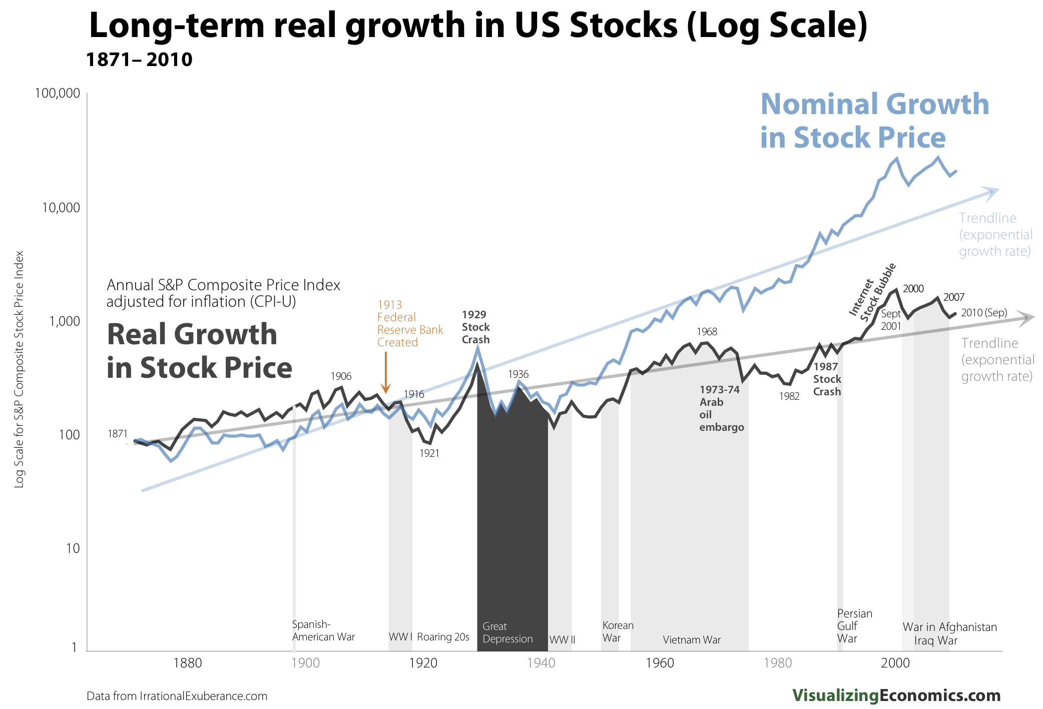
We have previously mentioned these terrific long term charts (here and here) from Catherine at Visualizing Economics.
She just updated them to show the impact of inflation on long term returns in giant graph.
When overlayed on the timeline, the differences between real and nominal gains becomes readily apparent:
>
Click for truly ginormous chart
Source: Visualizing Economics


What's been said:
Discussions found on the web: