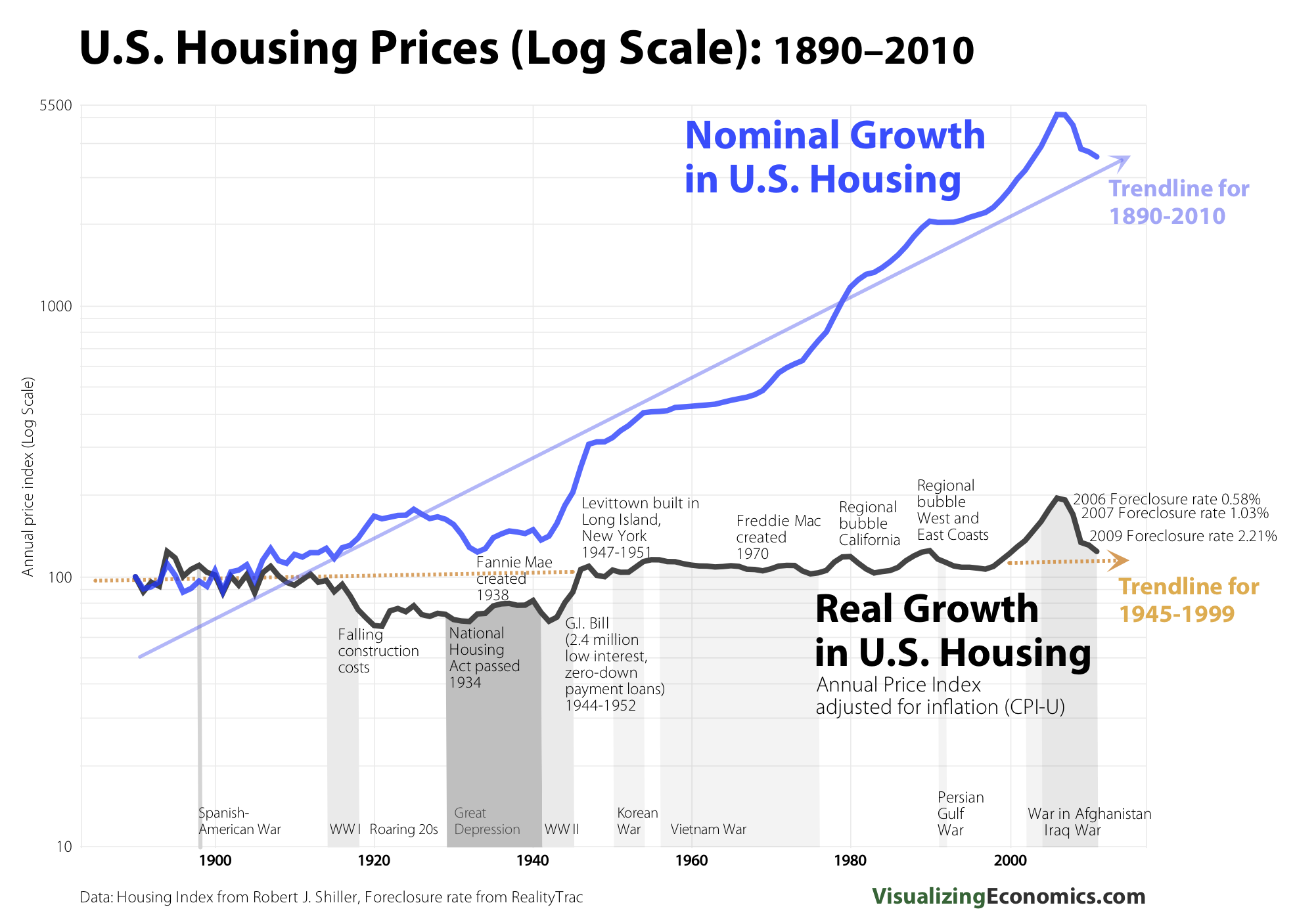
Following the record low data in New Home Sales yesterday, we looked at a 50 year chart of that plumbed the depths of that data series. Today, I want to expand upon that and look at a 120 year chart of real vs. nominal home prices, via Visualizing Economics.
There are a few noteworthy items on the chart: The Great Depression saw Housing prices collapse, but in real terms the price of housing had been slowing for a while (for many reasons).
The GI Bill, post WW2 boom, the widespread ownership of automobiles saw the growth of the suburbs and a major housing boom. In nominal terms housing prices began to rise above trend levels in the 1980s, and then in the late 1990s saw some additional price gains as profits rotated from equities to residential RE.
In both real and nominal terms, the 2000s saw home prices go ballistic.
>


What's been said:
Discussions found on the web: