The MSM has a series of terrific interactive charts, maps and animations:
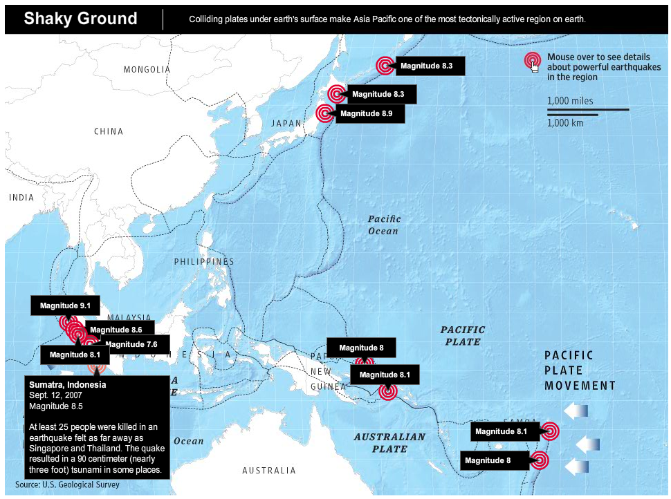
Let’s start with the WSJ‘s Pacific/Australian tectonic plates. Note how many major earthquakes have occurred in this region.
click for larger chart, go here for article and interactive graphic

>
Next up is the NYT, which first looks at both how reactors work:
click for interactive graphics

>
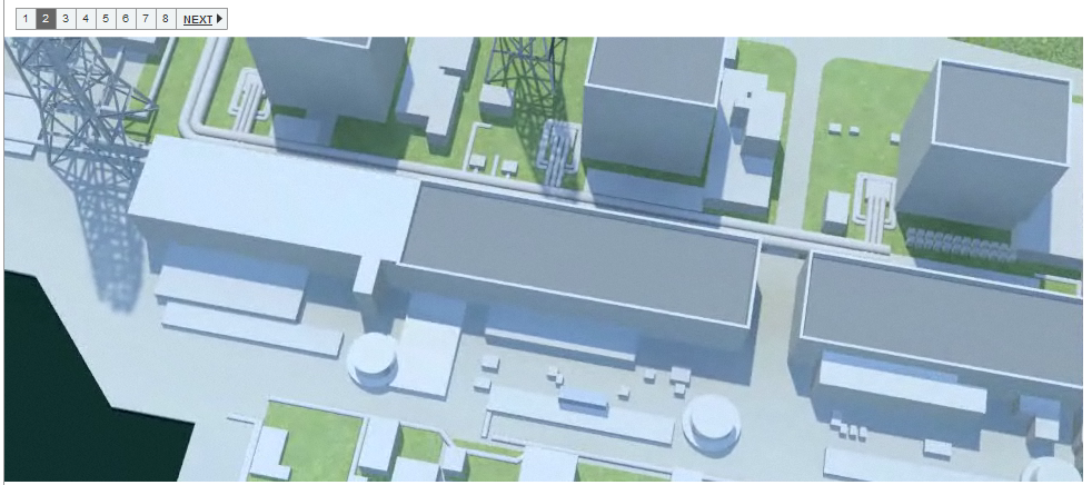
And then the specific issues in the Japanese Fukushima Daiichi Nuclear Power Station:
click for interactive graphics

>
Sources
Japan’s Nuclear Crisis Escalates (WSJ)
Panic Selling in Japan Weighs on Global Markets (NYT)
How a Reactor Shuts Down and What Happens in a Meltdown (NYT)


What's been said:
Discussions found on the web: