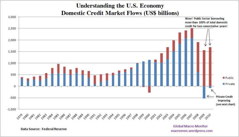
To understand the U.S. economy go no further than the following two charts. In 2009 and 2010, public sector borrowing was more than 100 percent of total net domestic credit flows. Federal government borrowing was 93 percent of these flows. The chart also shows the incredible collapse of U.S. credit bubble.
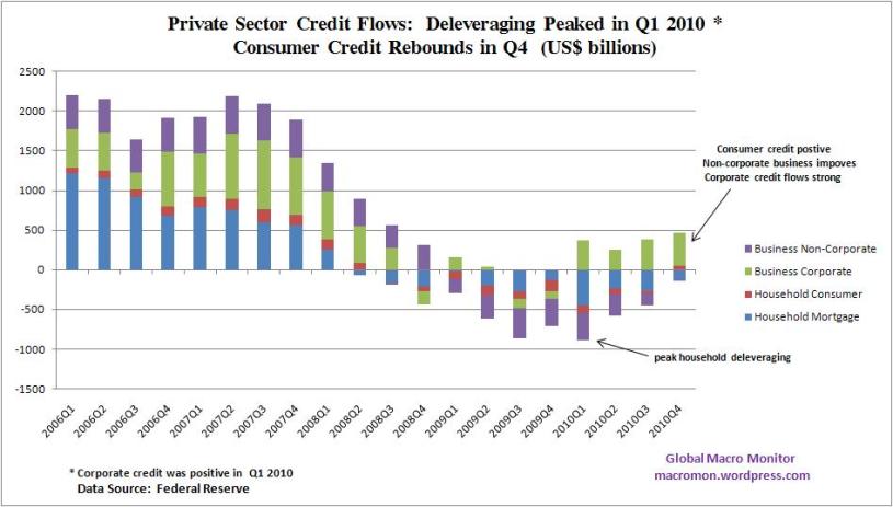
Private sector deleveraging peaked in Q1 2010 and net consumer credit in Q4 was positive for the first time since Q2 2008. Net mortgage flows remain negative and corporate credit flows are picking up stream.
The first chart illustrates why the U.S. money supply has not exploded even though the Federal Reserve has almost tripled the monetary base. The second chart shows why inflation concerns are increasing, however, as domestic credit markets heal and are primed with a massive arsenal high powered money.

 (click here if charts are not observable)


What's been said:
Discussions found on the web: