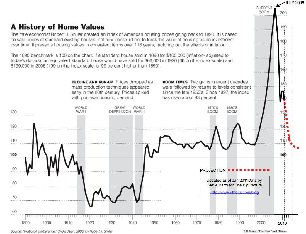
In 2006, just as the Housing market was peaking, the NYT ran this graphic of the 100-year Case Shiller chart. It showed how radically overvalued Housing had become.
Two years later, TBP reader Steve Barry updated that graphic, including the projected Home Price mean reversion. (See versions for 2008, 2009 and 2010).
Its time to update this for 2011. Note the 2009 tax credit wiggle:
We plan to keep updating this annually until that mean reversion to fair value is achieved.
>
~~~
Note: This chart has been liberally copied without identifying either the source or author. If you see this elsewhere on the intertubes, you should recognize that it was created by Steve Barry, and is originally published here at TBP.
This chart may be reproduced freely if appropriate authorship/publishing credit is given.


What's been said:
Discussions found on the web: