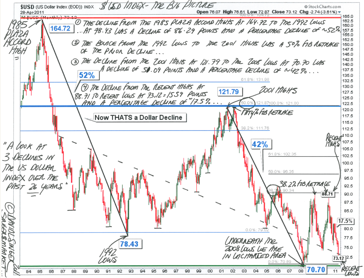
I felt the need to put the recent dollar weakness into some broader context. So last weekend, I showed this simple 15 year chart of the dollar, showing the huge 41.5% coolapse from 2001-08, versus the current 15+% drop.
The feedback was surprisingly; apparently, many of those currently freaking out about the dollar missed it last time.
Today, let’s show an even longer term chart — this one, incorporating the 1980s collapse — the worst of the 3 we have experienced in the past 40 years.
>
Annotated chart via David Singer
>
Previously:
Dollar’s Biggest Decline? 2001-08 (April 23rd, 2011)
Currency Wars! (October 11th, 2010)


What's been said:
Discussions found on the web: