>
Since we have the NFP report at the end of the week, I thought it might be instructive to use our lunchtime chart slot each day to look at assorted employment data.
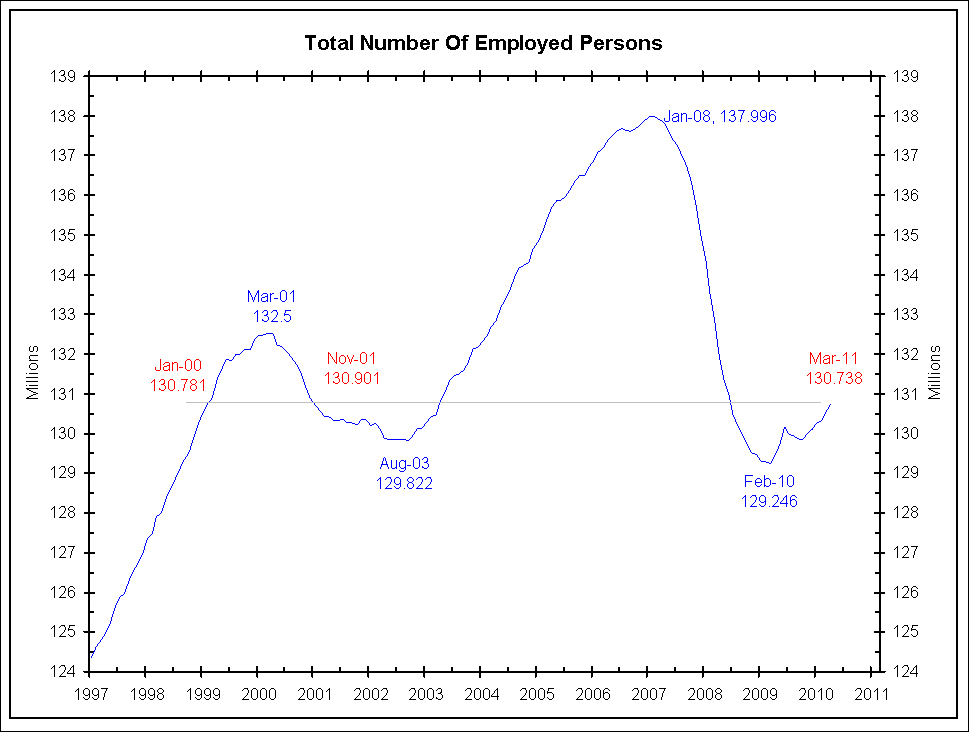
Today’s chart comes to us from Jim Bianco of Bianco Research. The chart looks at the Total number of employed people in the US.
Note that in 2011 we are back to levels last seen 1999, 2001 and 2003. But the caveat is that the population has grown substantially since then; On a percentage basis, employment is considerably worse than it was in any of those years . . .
~~~
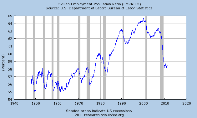
Invictus adds: To put this into context, see the Civilian Employment-Population Ratio (EMRATIO)
click for larger chart

via FRED


What's been said:
Discussions found on the web: