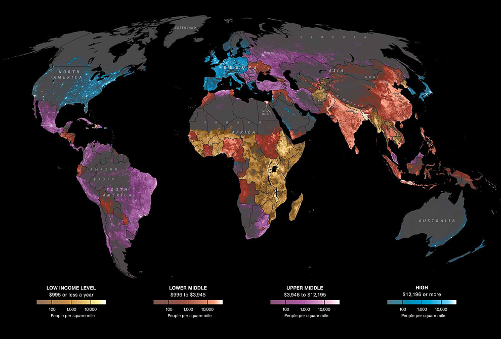
This interactive Nat Geo chart shows the distribution of income around the globe:
>
Click into interactive map for more information

Source:
National Geographic, The World of Seven Billion
This interactive Nat Geo chart shows the distribution of income around the globe:
>
Click into interactive map for more information

Source:
National Geographic, The World of Seven Billion
What's been said:
Discussions found on the web: