The Beveridge Curve
David R. Kotok
May 4, 2012
“I have a thousand things to do”
–the reported last words of British economist William Beveridge, as he sat up in bed while still working on his eighth and only unfinished book, History of Prices.
The classic eponymous Beveridge Curve “is a graphical representation of the relationship between the unemployment rate and the job vacancy rate. It typically has vacancies on the vertical axis and unemployment on the horizontal. The curve slopes downwards as a higher rate of unemployment normally occurs with a lower rate of vacancies. If it moves outwards over time, then a given level of vacancies would be associated with higher and higher levels of unemployment, which would imply decreasing labor market efficiency. Inefficient labor markets are due to mismatches between available jobs, the unemployed and an immobile labor force.” (Wikipedia definition)
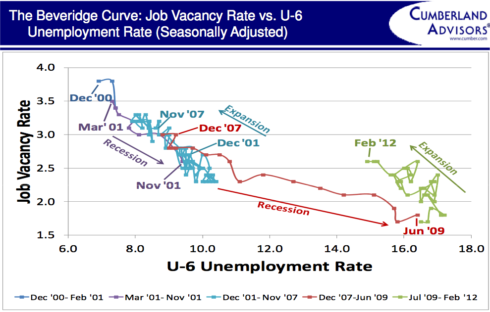
We have constructed a Beveridge Curve:
Source: Bureau of Labor Statistics, Current Population Survey and Job Openings and Labor Turnover Survey, April 10, 2012, Cumber.com
We used the U6 unemployment rate and the job vacancy rate. The statistics source is the Bureau of Labor Statistics (BLS). We selected the U6 instead of the U2 because it includes working folks who are earning much less than their former labor income. We think that such folks would seek to fill a job vacancy for higher pay if they were qualified and if they could relocate to that job.
We decided to focus on the Beveridge Curve for the US rather than today’s (Friday) employment report. It has received so much attention and debate that it competes with the Kentucky Derby as a gambling event.
For the last decade the B-curve has been moving downward and out to the right. That suggests the change in the labor force in the US is structural and not cyclical. We have color-coded sections of the curve. They are labeled “Expansions” (economic recoveries) and “Recessions” (there are two recessionary periods). For recessions we are using the NBER definition.
Notice how the longer-term structural trend is temporarily reversed in each of the cyclical recoveries. Also notice how the cyclical recovery is not strong enough to overcome the longer-term downward trend. The most recent recovery is still underway and shows the nature of the slow repair to the labor force and the continuing jobs vacancy issue. This B-curve says that we are improving and that we doing so from a very low level. It does not say if we will reverse the longer-term structural trend. The most recent employment report (today) gives us no comfort in this regard.
Can the United States reverse the longer-term trend? What happens if it does? Or does not? Does it take a housing market recovery to permit mobility to return to the labor force? Are there unfilled jobs in some industries because there are too few well-trained workers who seek them? That seems to be the case in IT and healthcare.
The B-curve does not explain why it acts as it does. It does say that the longer-term structural trend is intact as of the most recent data point. That suggests the ongoing economic recovery will remain at a slow pace.
For markets this means lower levels of labor cost pressure will be with us for a while. That means low inflation pressure, higher profits, and a continuation of Federal Reserve policy focused on low short-term interest rates.
That combination is bullish for stocks for the time being. It is also and only bullish for bonds as long as the Fed makes no noises about changing policy to an earlier tightening. So far, that is the position of the majority of the Fed decision makers. We remain fully invested.
~~~
David R. Kotok, Chairman and Chief Investment Officer


What's been said:
Discussions found on the web: