This SPX Chart Is Deeply Concerning for Traders . . .

Source: The Chart Store
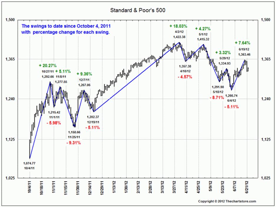
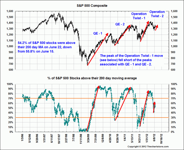
The charts above, courtesy of Ron Griess of the Chart Store, are something that should give investors and traders pause.
The first chart shows the decreasing impact of each Federal Reserve liquidity injection into the open and hungry veins of the market. It should be of concern to investors. Every subsequent hit of that sweet, sweet junk yields a less intense high.
The second chart shows that the uptrend that began Q4 is broken; rally attempts failed pretty much where you would expect them to. Any further weakness (under the cover of EU worries or Debt ceiling shenanigans or other rationalizations) could lead to a move back down to that December low of 1202 or the October low 1074.


What's been said:
Discussions found on the web: